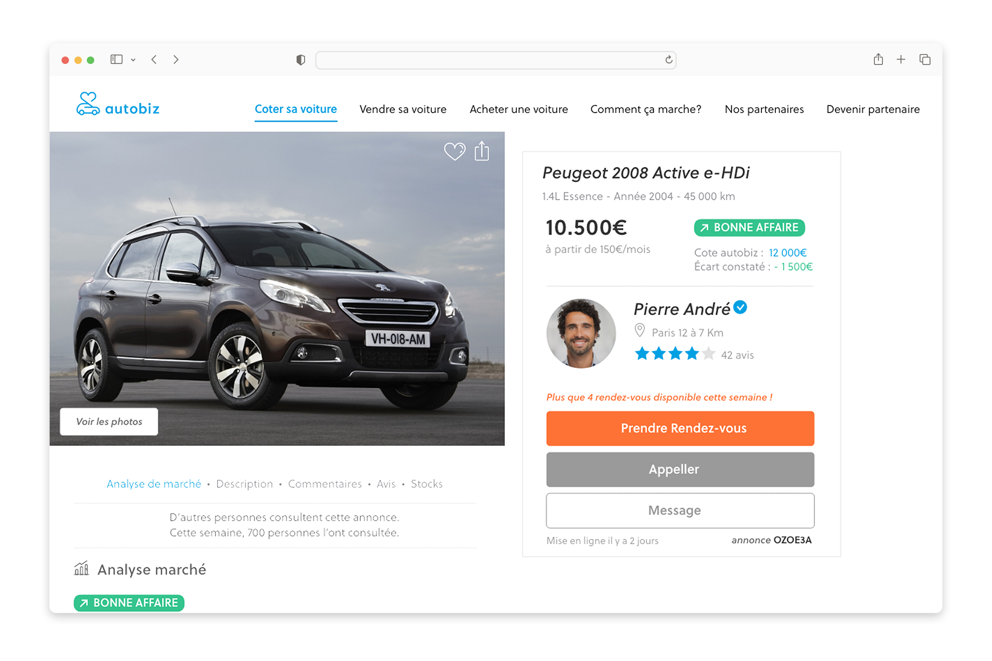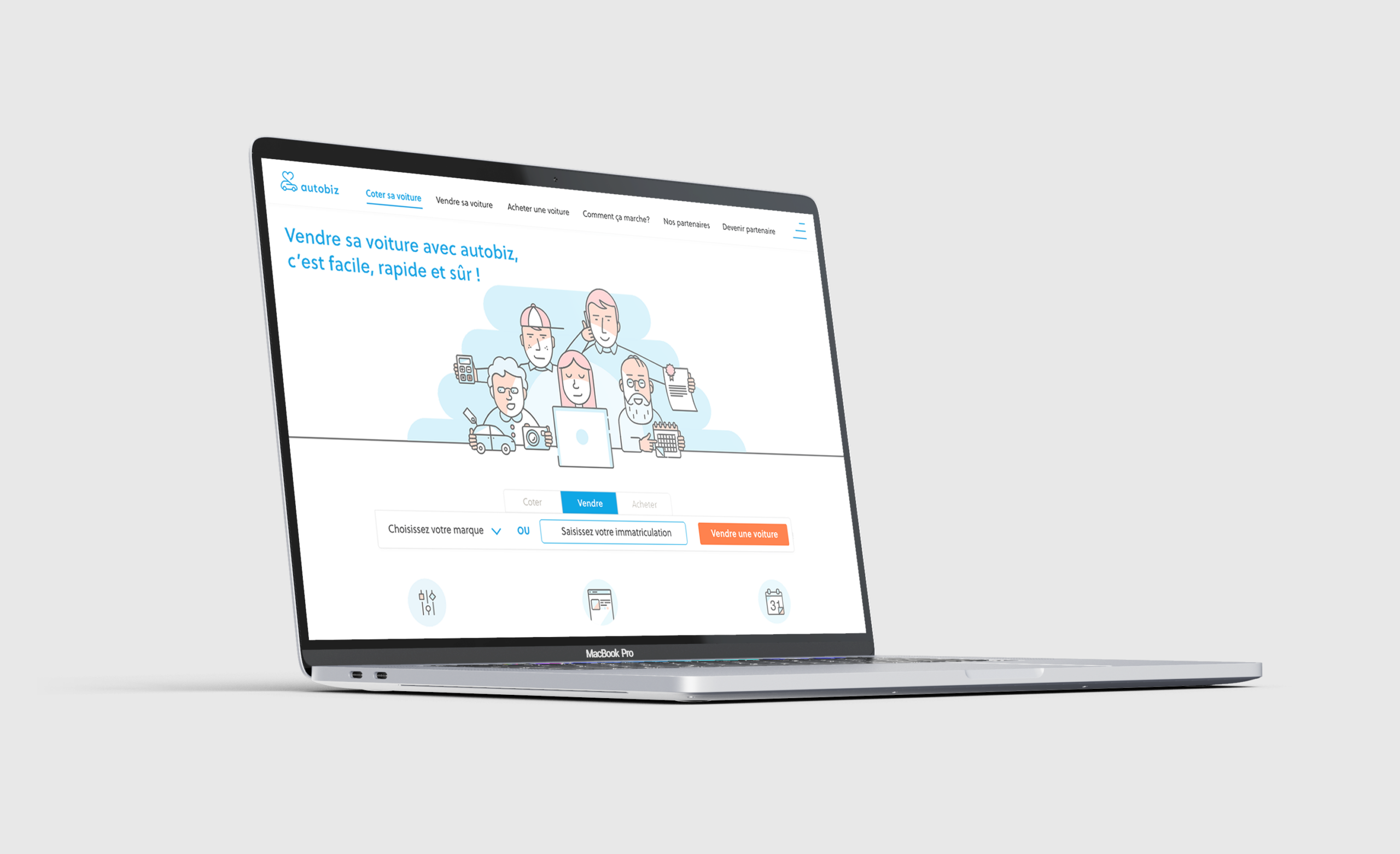
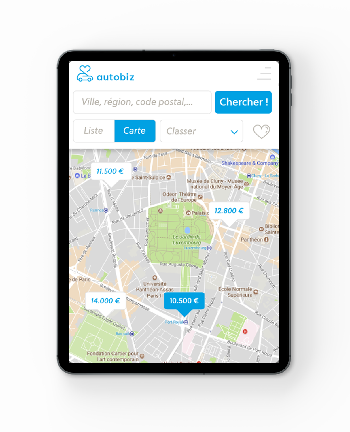
Autobiz is a French company specializing in online car valuation and vehicle trade-in services. The platform allows users to estimate the value of their vehicle and connect with professional buyers.
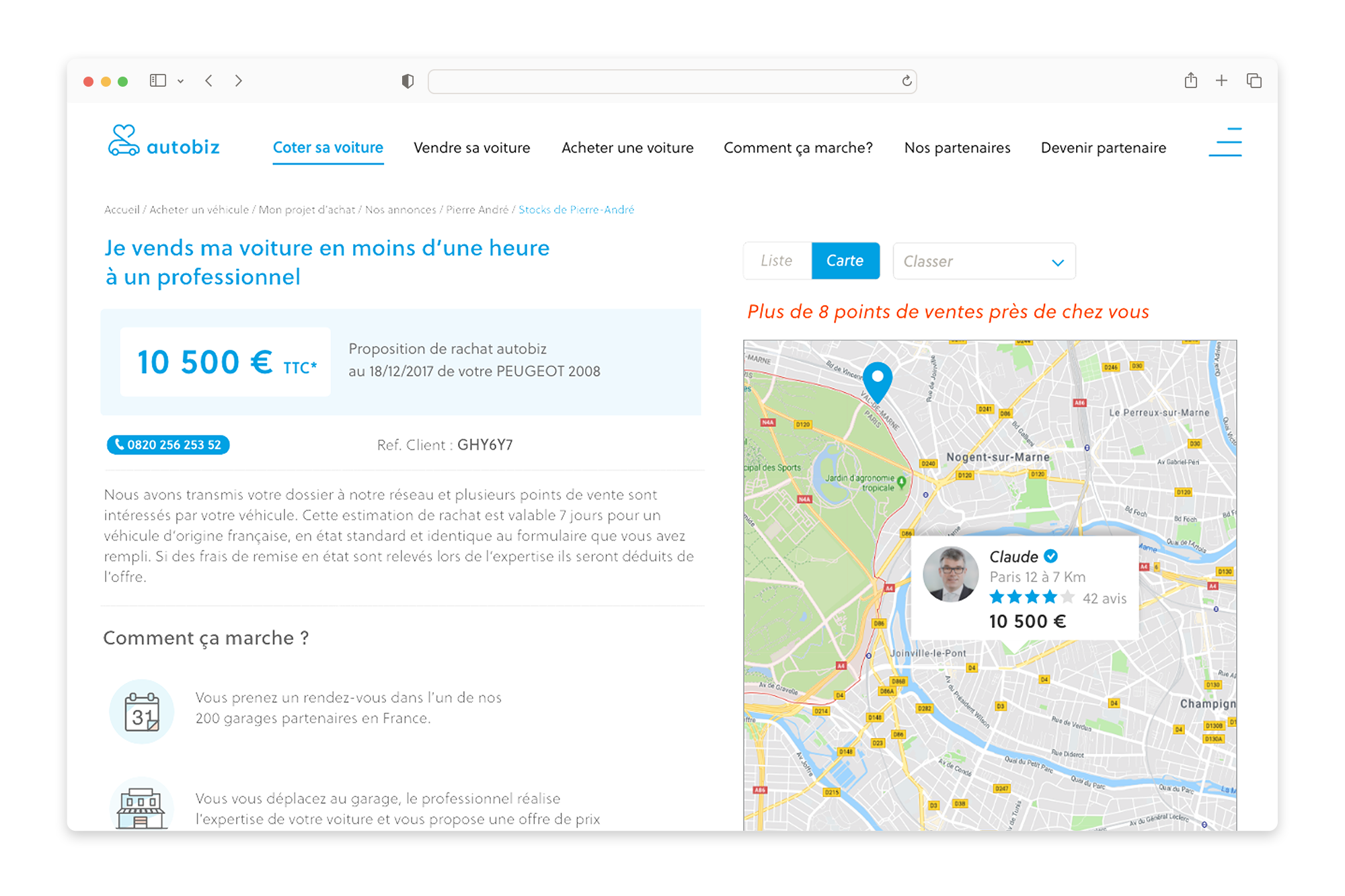
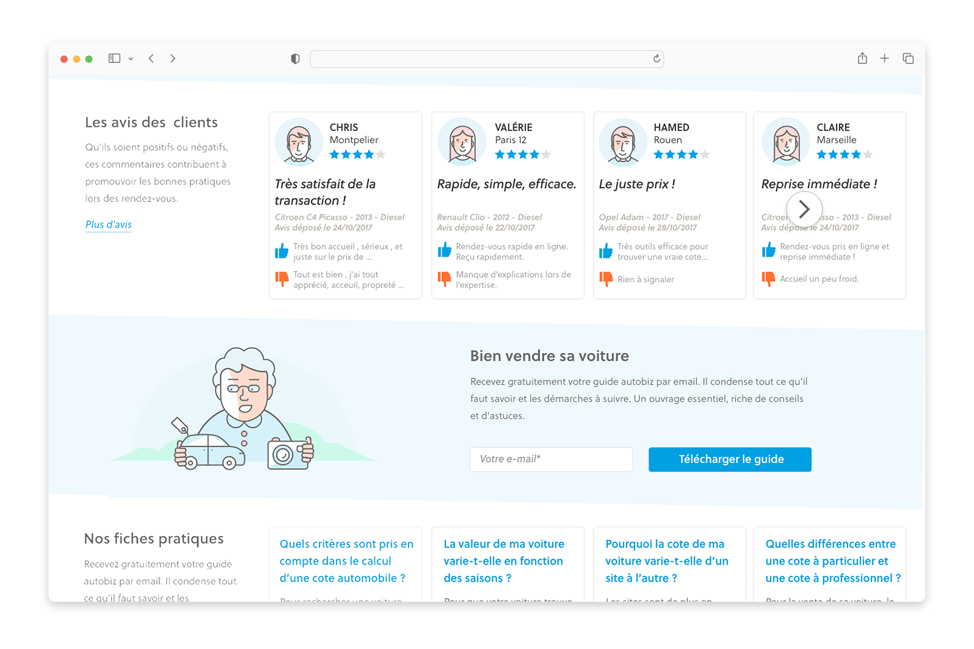
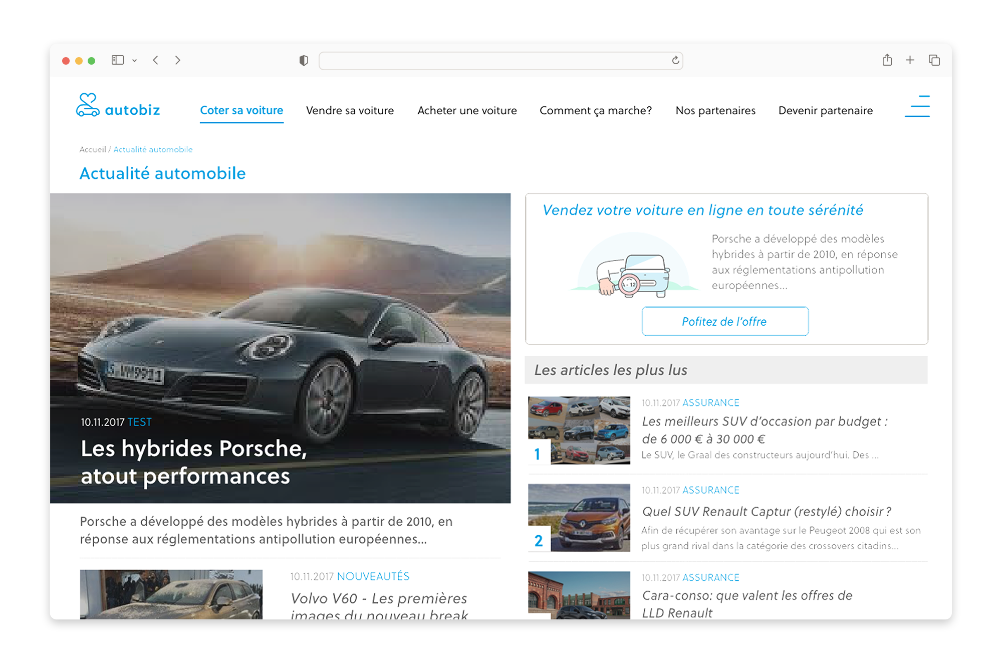
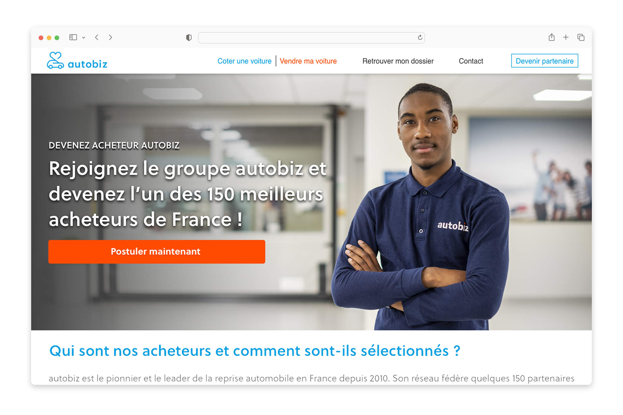
To strengthen the brand image and improve the overall user experience, a complete visual and digital design system was developed, combining brand identity, interface design, iconography and illustration.
Problem
Operating in a highly competitive automotive market, Autobiz needed a visual identity capable of conveying trust, transparency and technological expertise, while remaining accessible to a broad audience.
At the same time, complex processes such as vehicle valuation, inspection and resale needed to be simplified through clear, intuitive and user-friendly digital experiences.




Logotype
Logotype
The logotype combines the silhouette of a car with the shape of a heart, symbolizing proximity, trust and care for the customer. It also reflects the emotional relationship many people have with their car.
The wordmark typography was custom designed specifically for the brand, creating a distinctive and recognizable signature.
The symbol expresses the idea of a strong connection between the platform and its users, combining technological efficiency with a human dimension.
The logotype combines the silhouette of a car with the shape of a heart, symbolizing proximity, trust and care for the customer. It also reflects the emotional relationship many people have with their car. The wordmark typography was custom designed specifically for the brand, creating a distinctive and recognizable signature.
The symbol expresses the idea of a strong connection between the platform and its users, combining technological efficiency with a human dimension.







Typography
The typographic system is based on Facit, a contemporary sans-serif typeface.
Its neutral yet distinctive character ensures excellent readability across digital interfaces while maintaining a strong and modern graphic tone.
Iconography
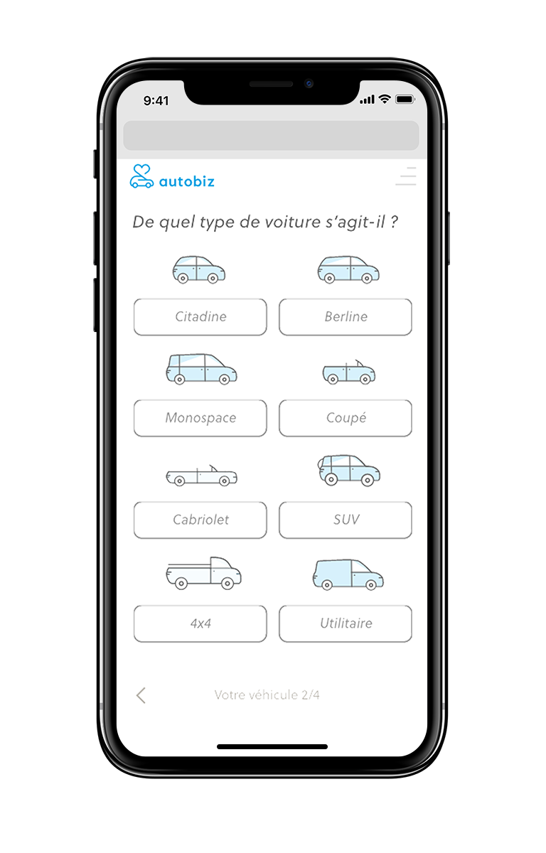
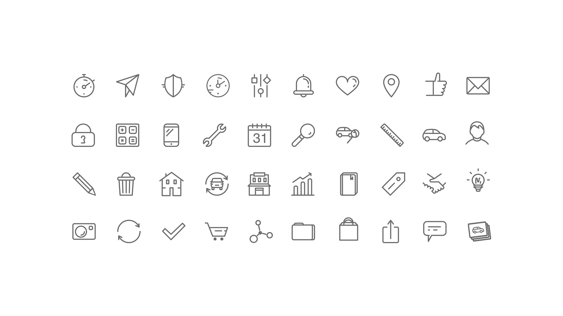
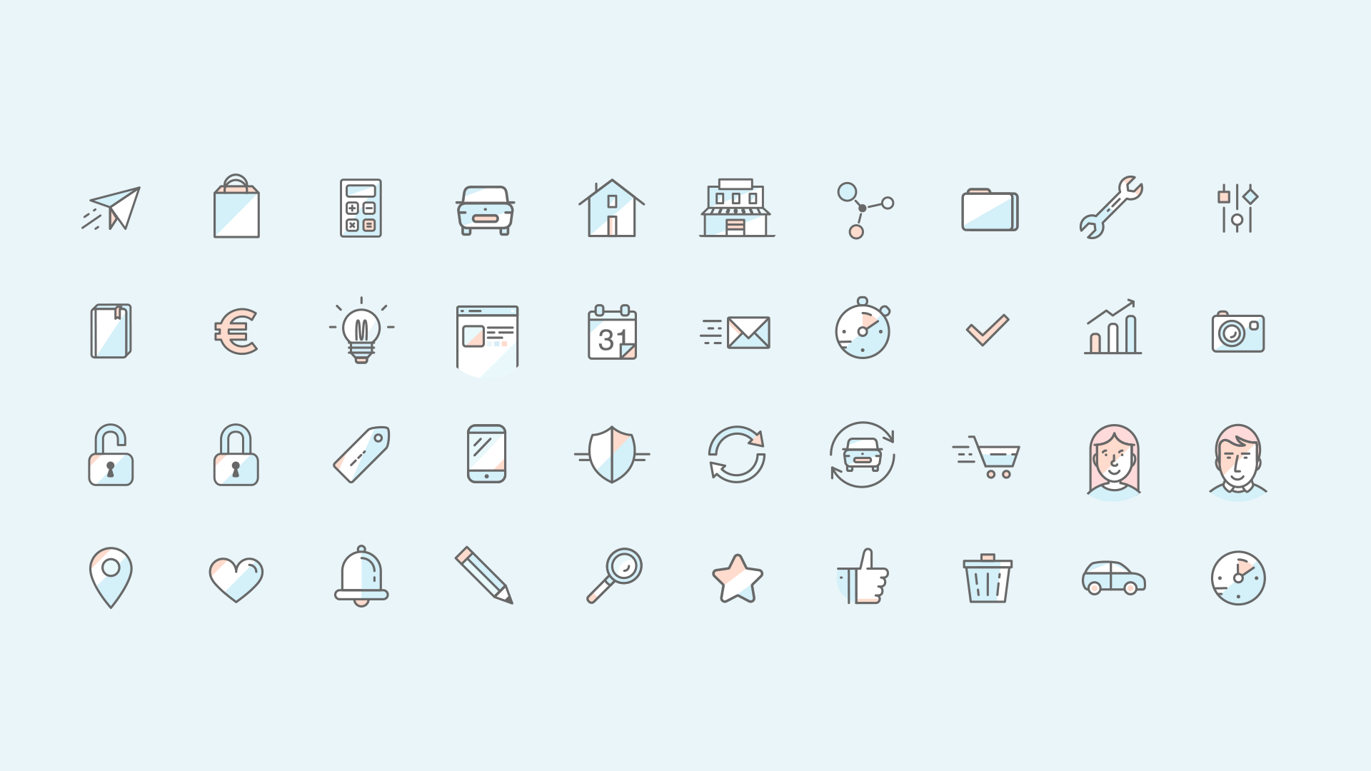
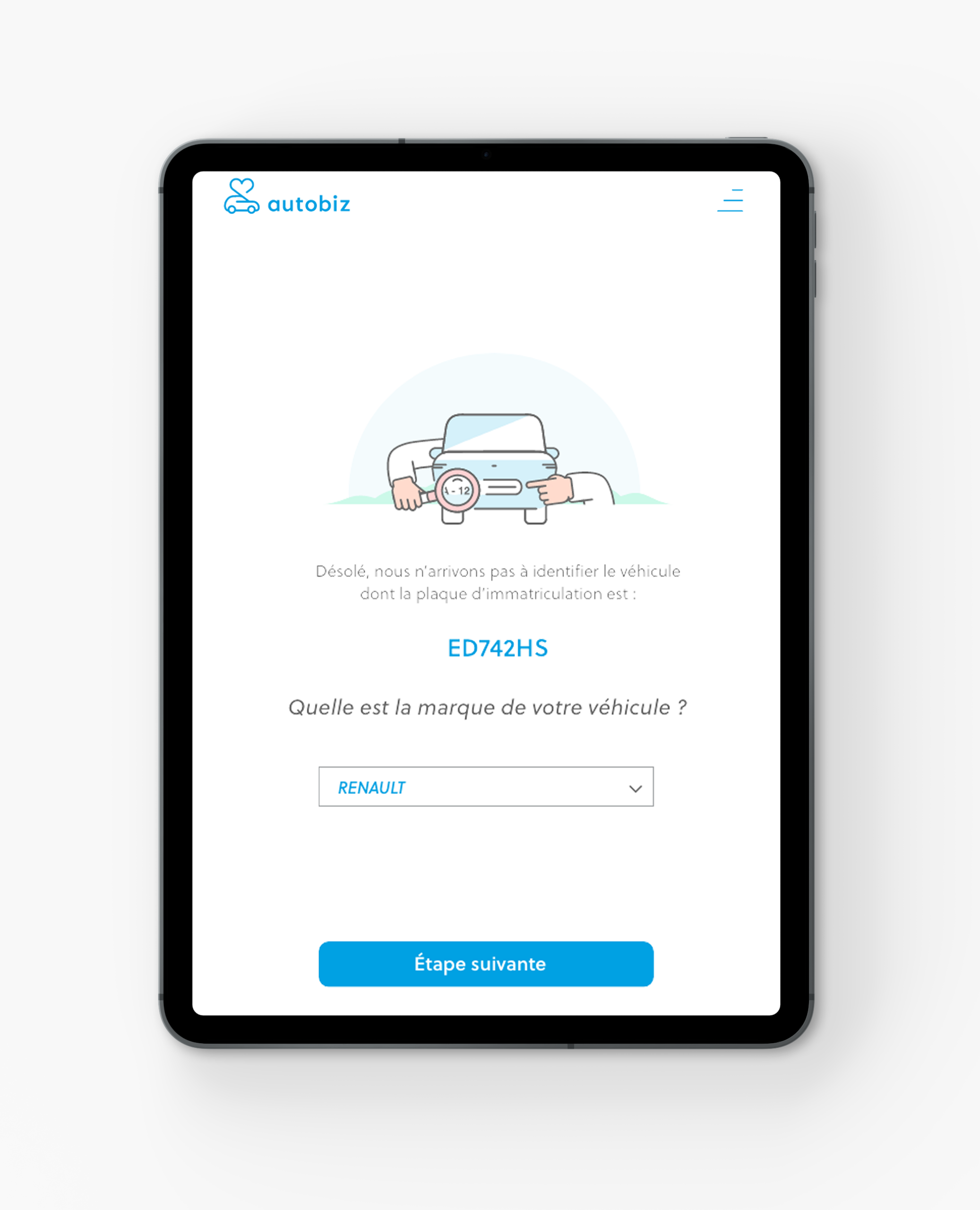
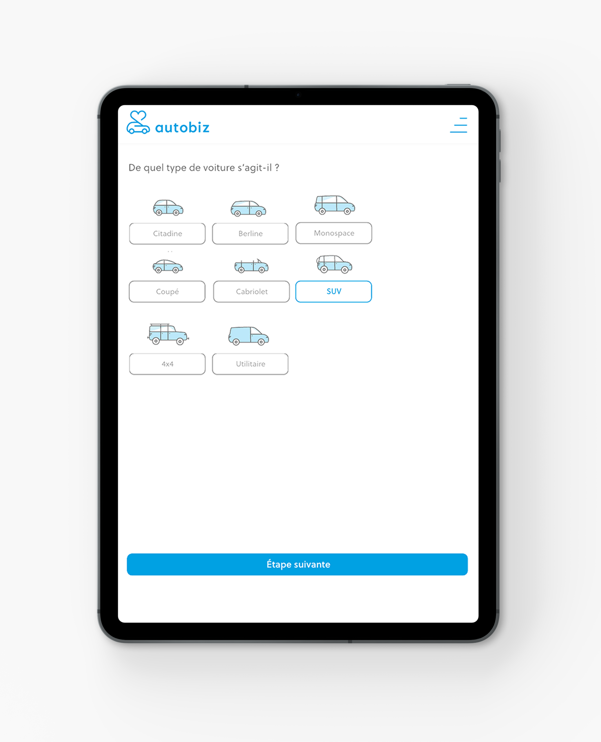
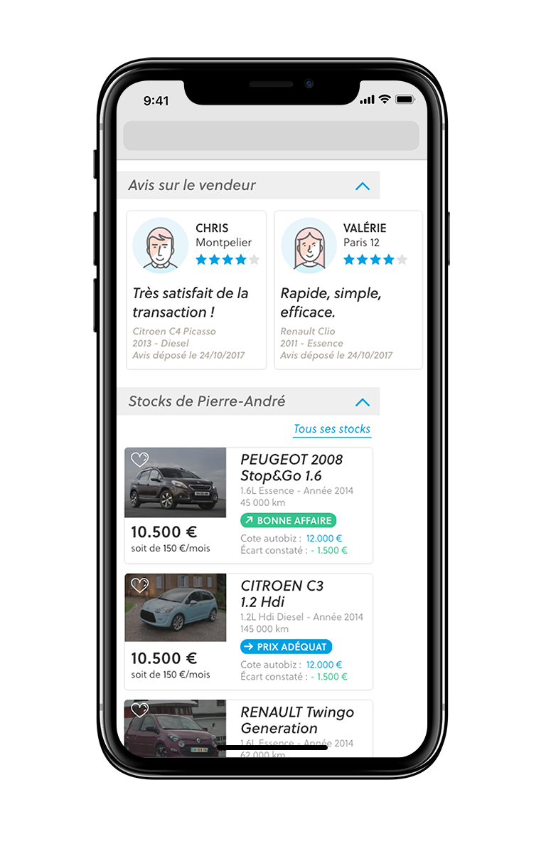
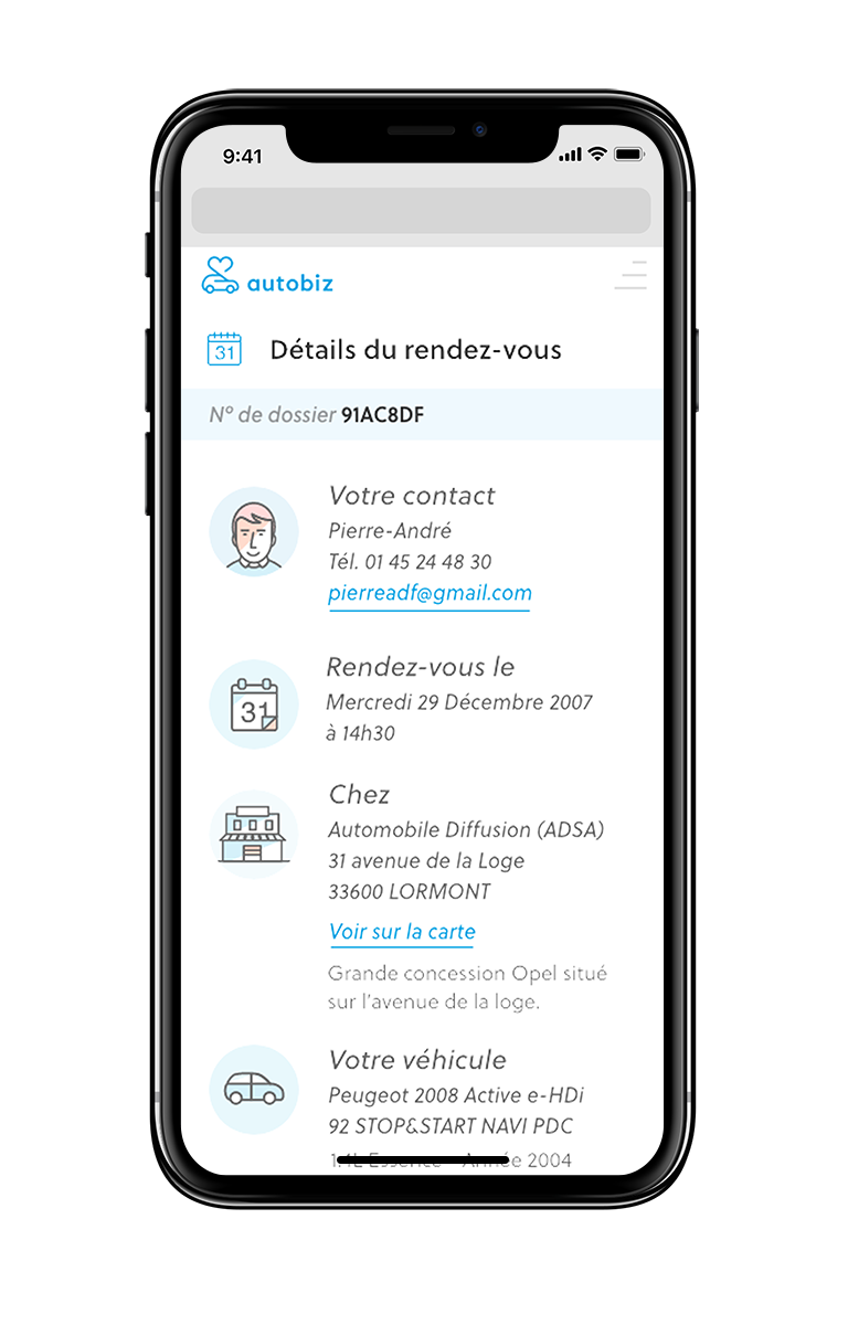
A modular system of vector icons was designed to represent services, interactions and features across the platform. The icons adopt a simple, colorful and expressive style, bringing a playful and approachable layer to the interface. Color is also used to differentiate categories of information, improving navigation and usability. The system places emphasis on human interaction and service, reinforcing the platform’s accessible character.
Illustration
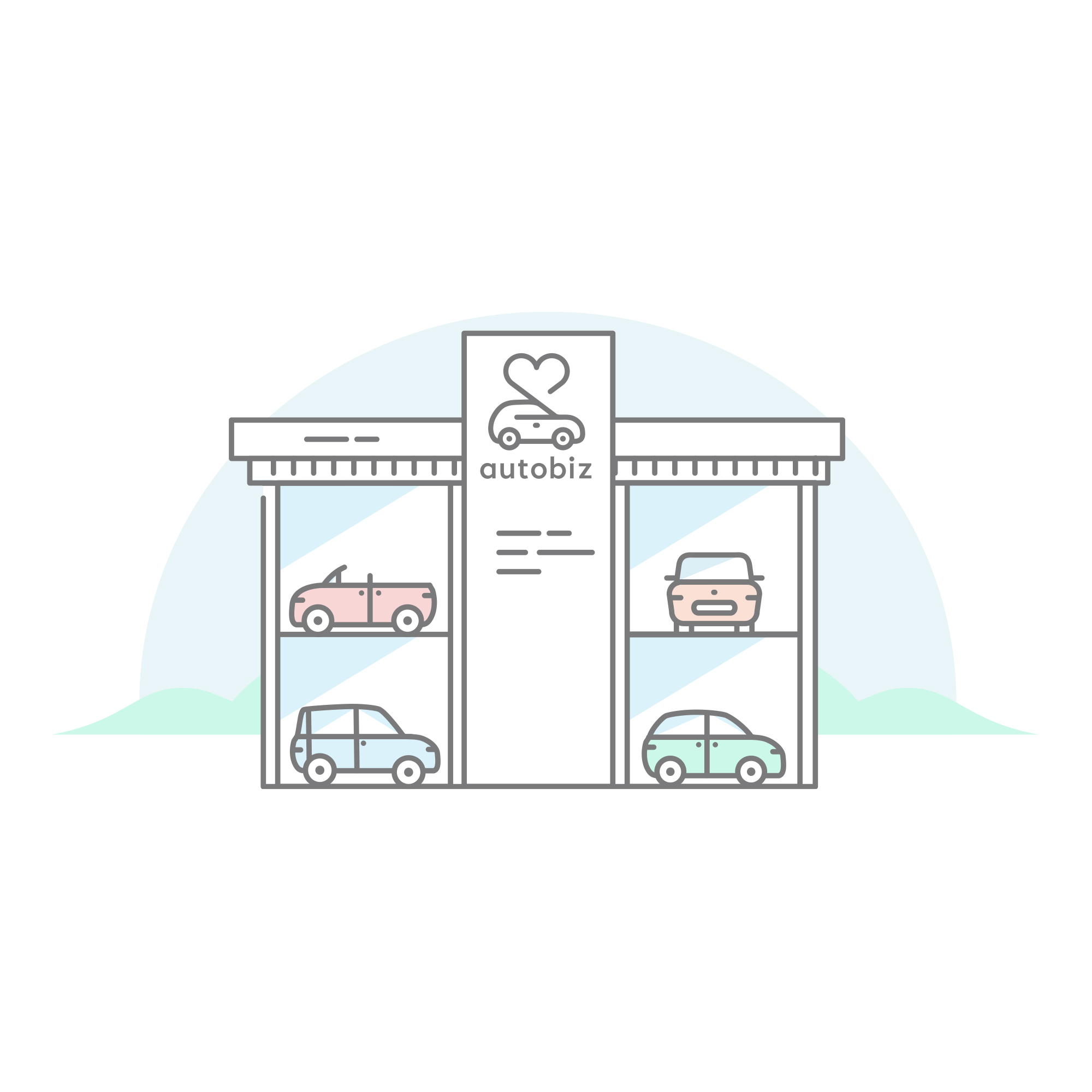
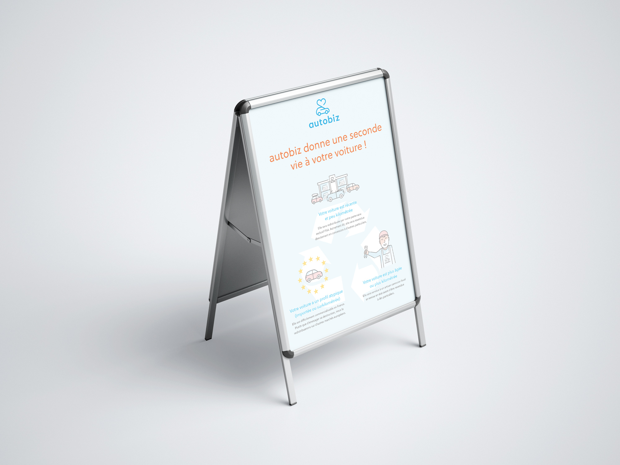
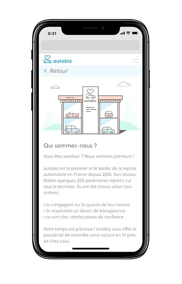
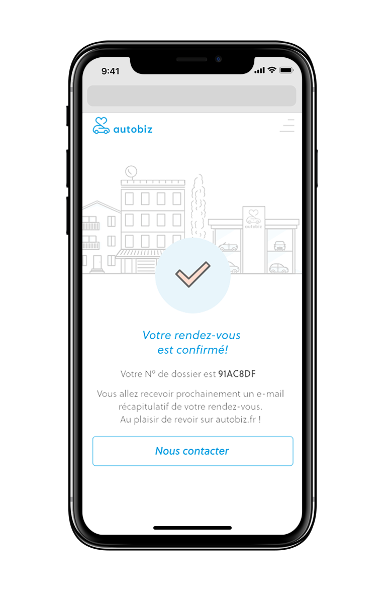
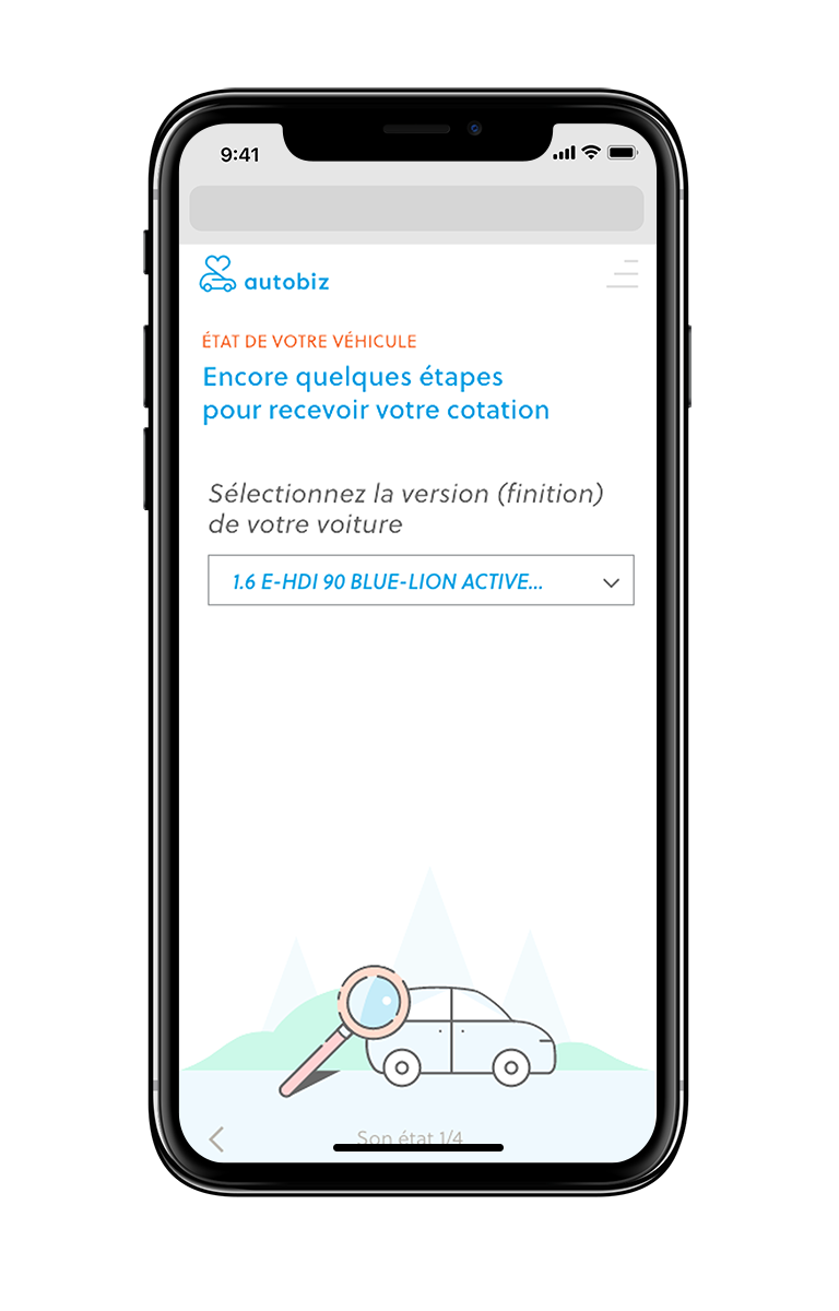
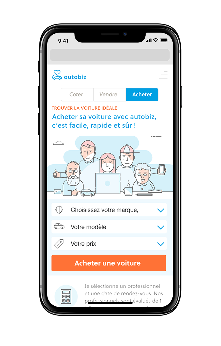
A series of custom vector illustrations was developed to differentiate Autobiz from competitors often relying on generic automotive imagery.
These illustrations depict characters and everyday automotive situations, helping to communicate the platform’s services while emphasizing proximity, technology and the company’s start-up spirit.











UX / UI Design
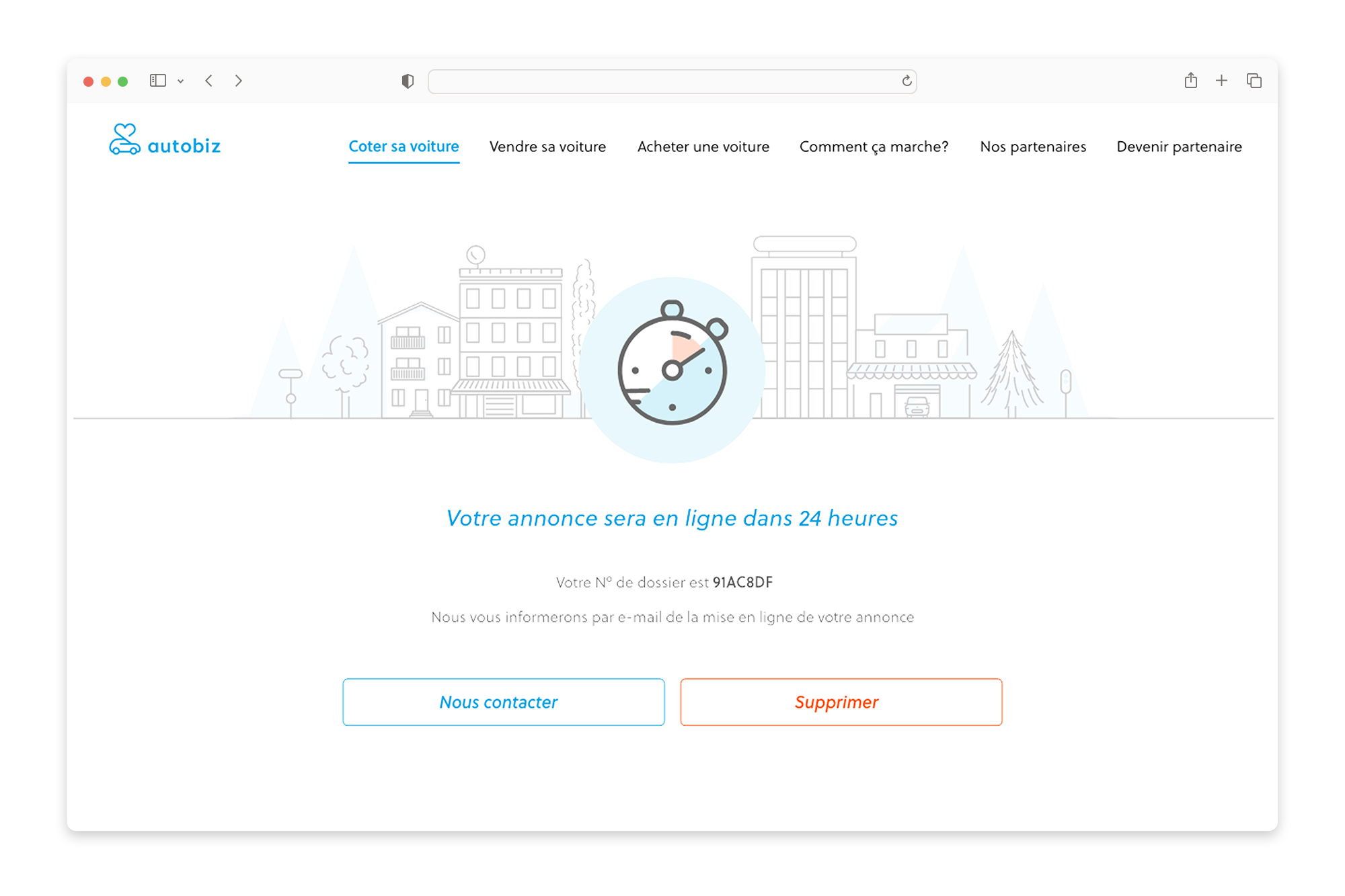
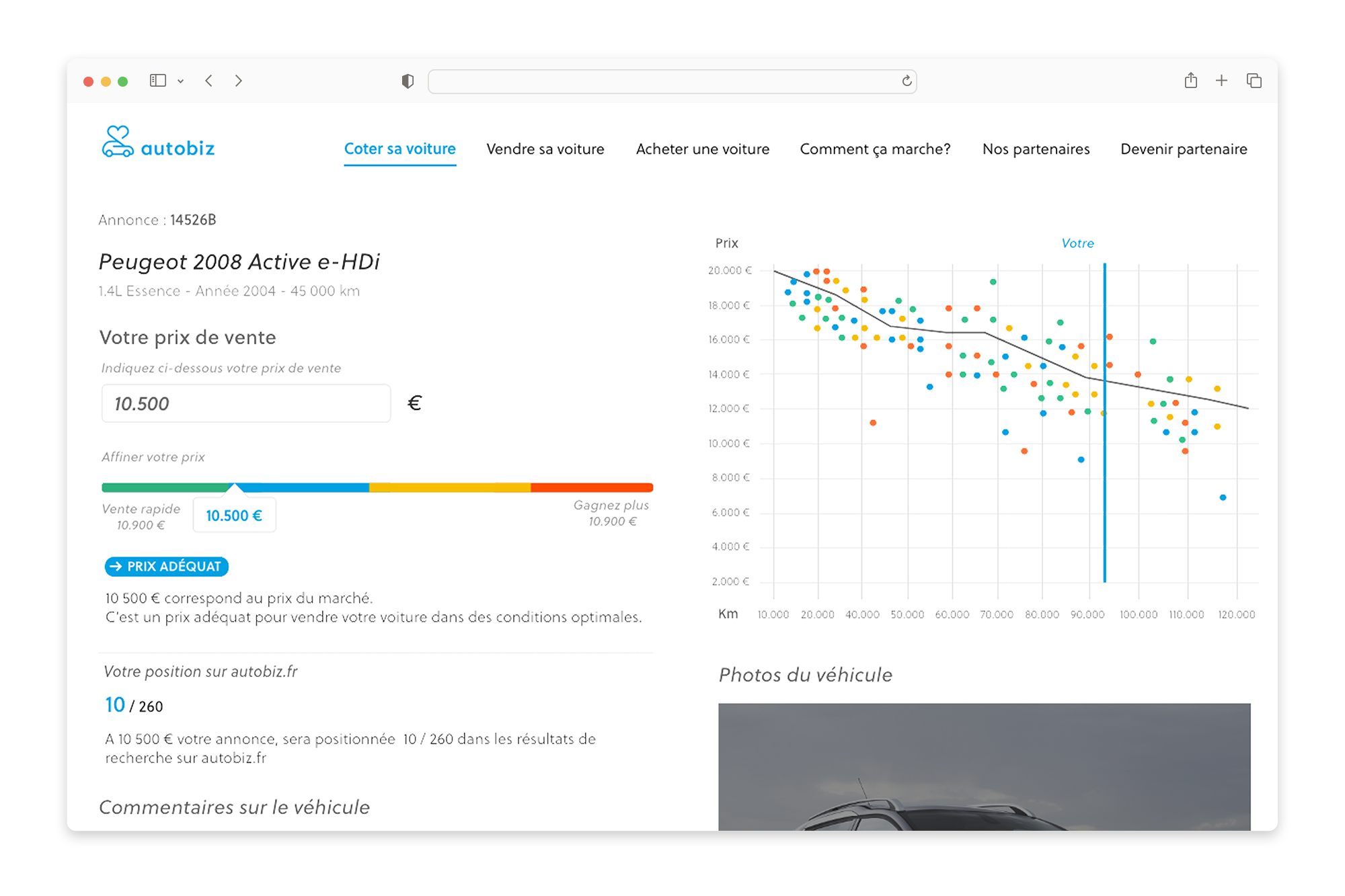
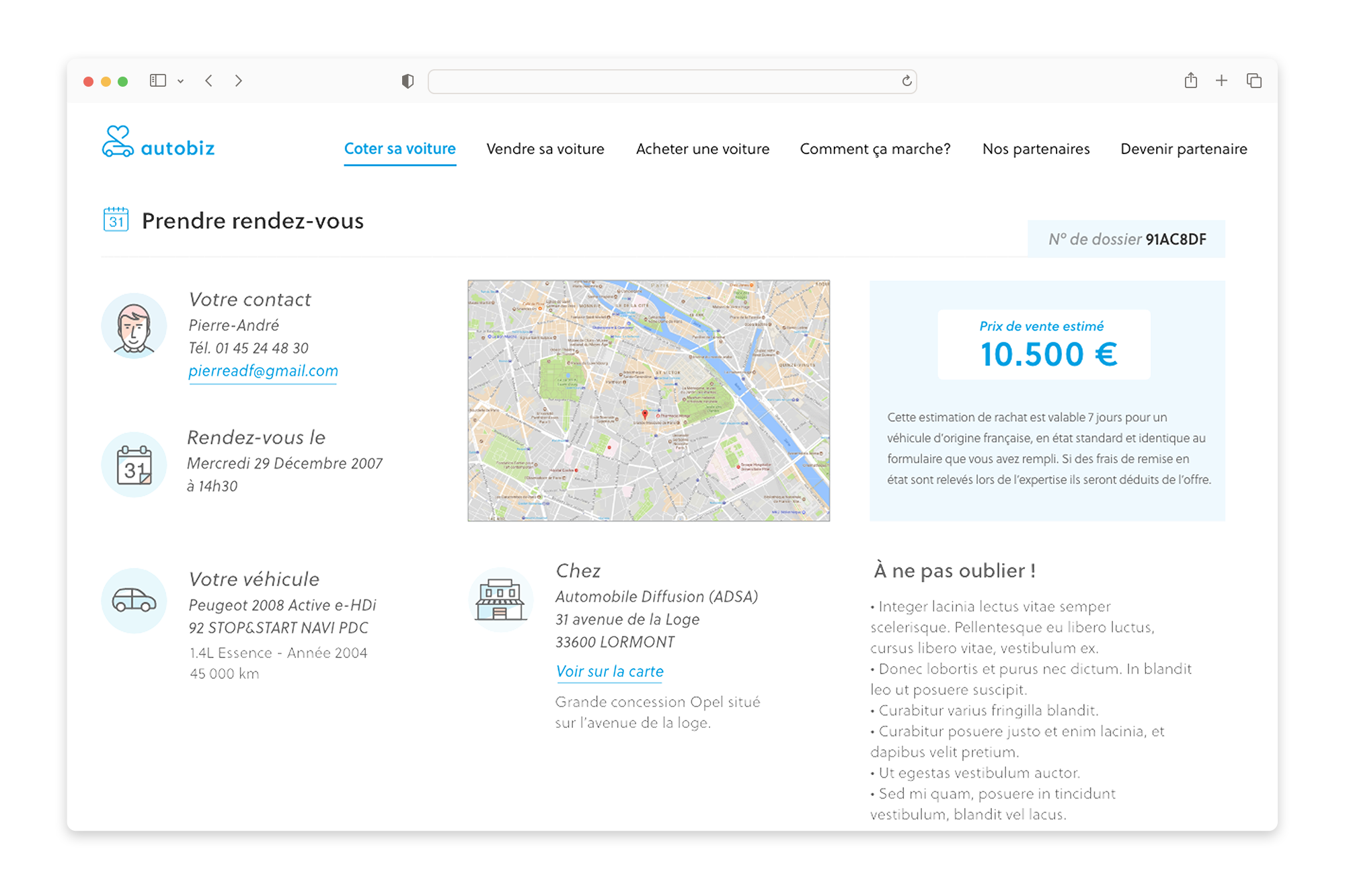
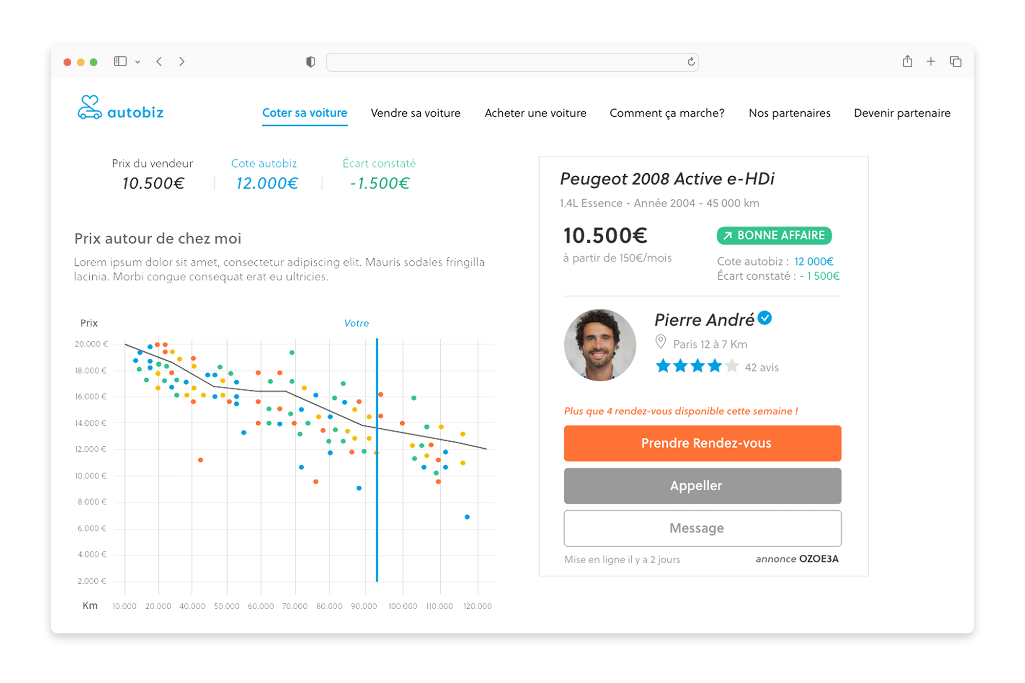
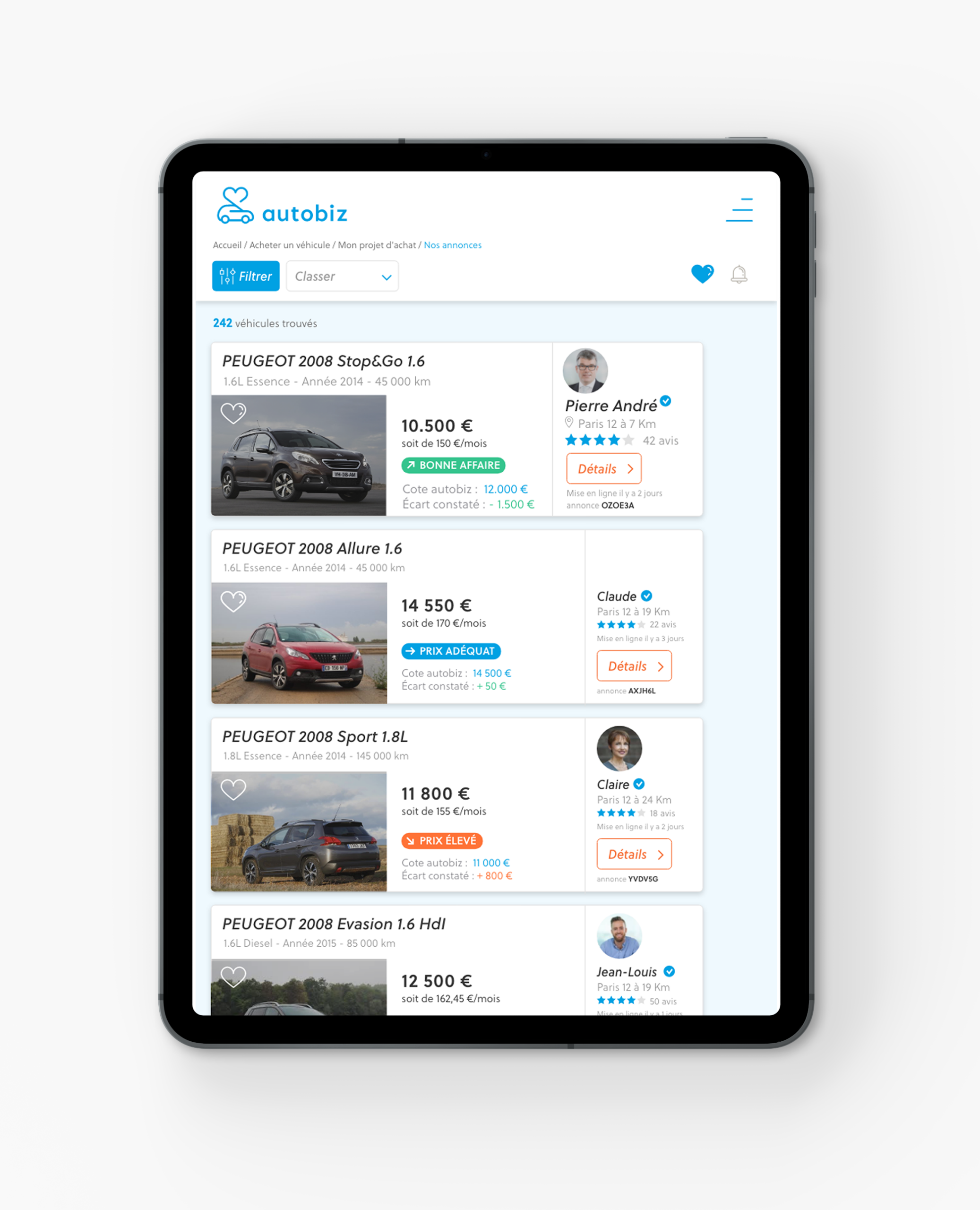
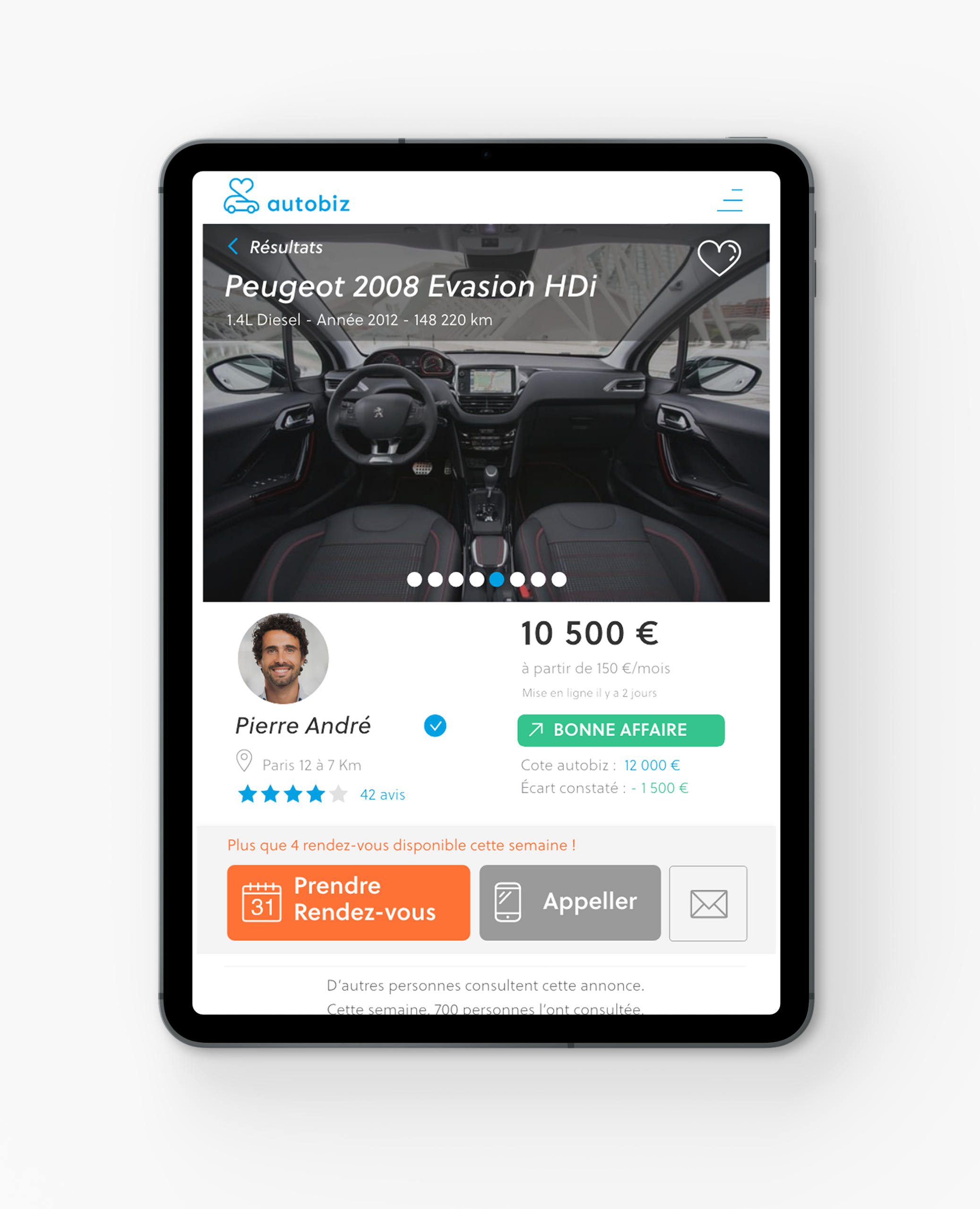
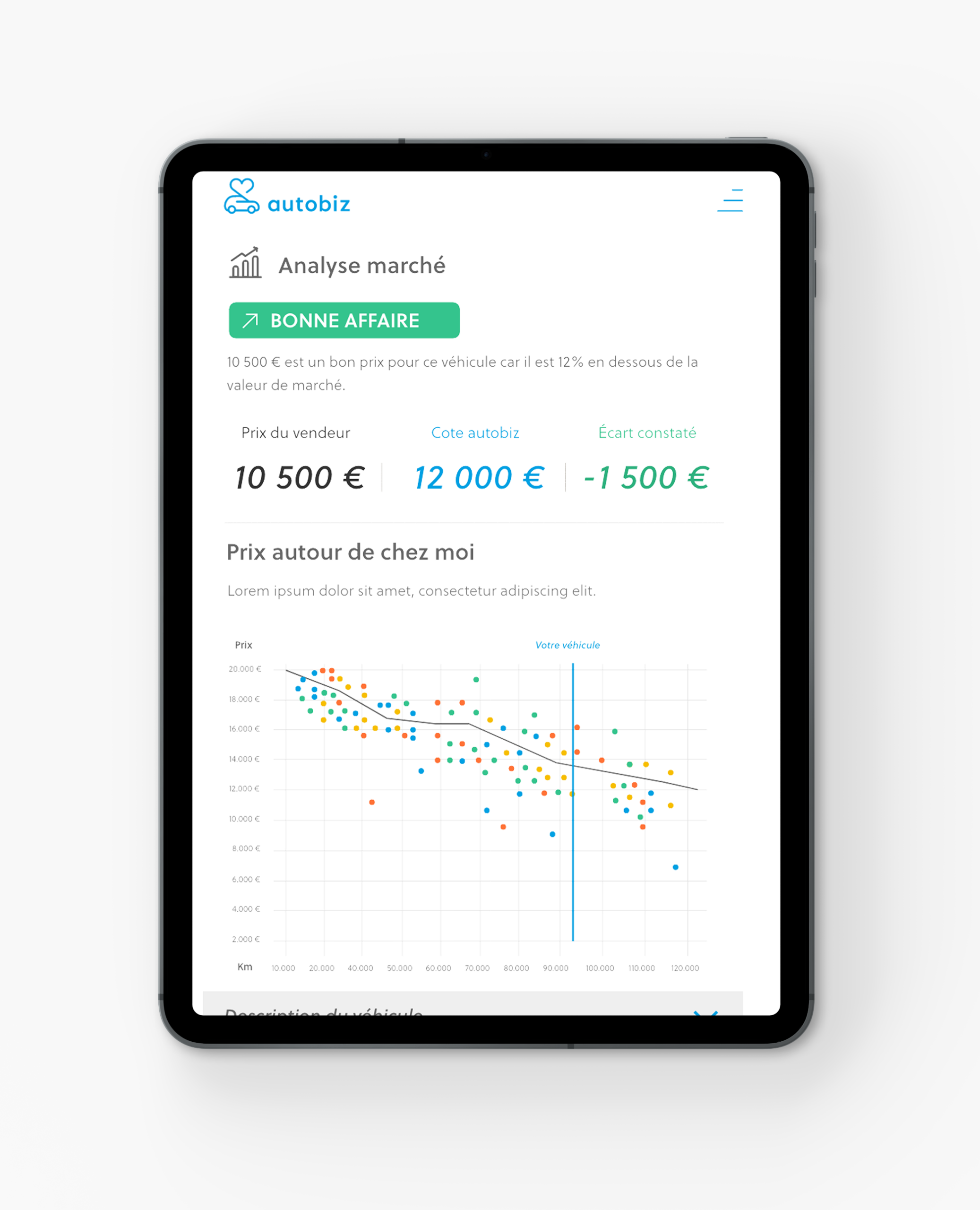
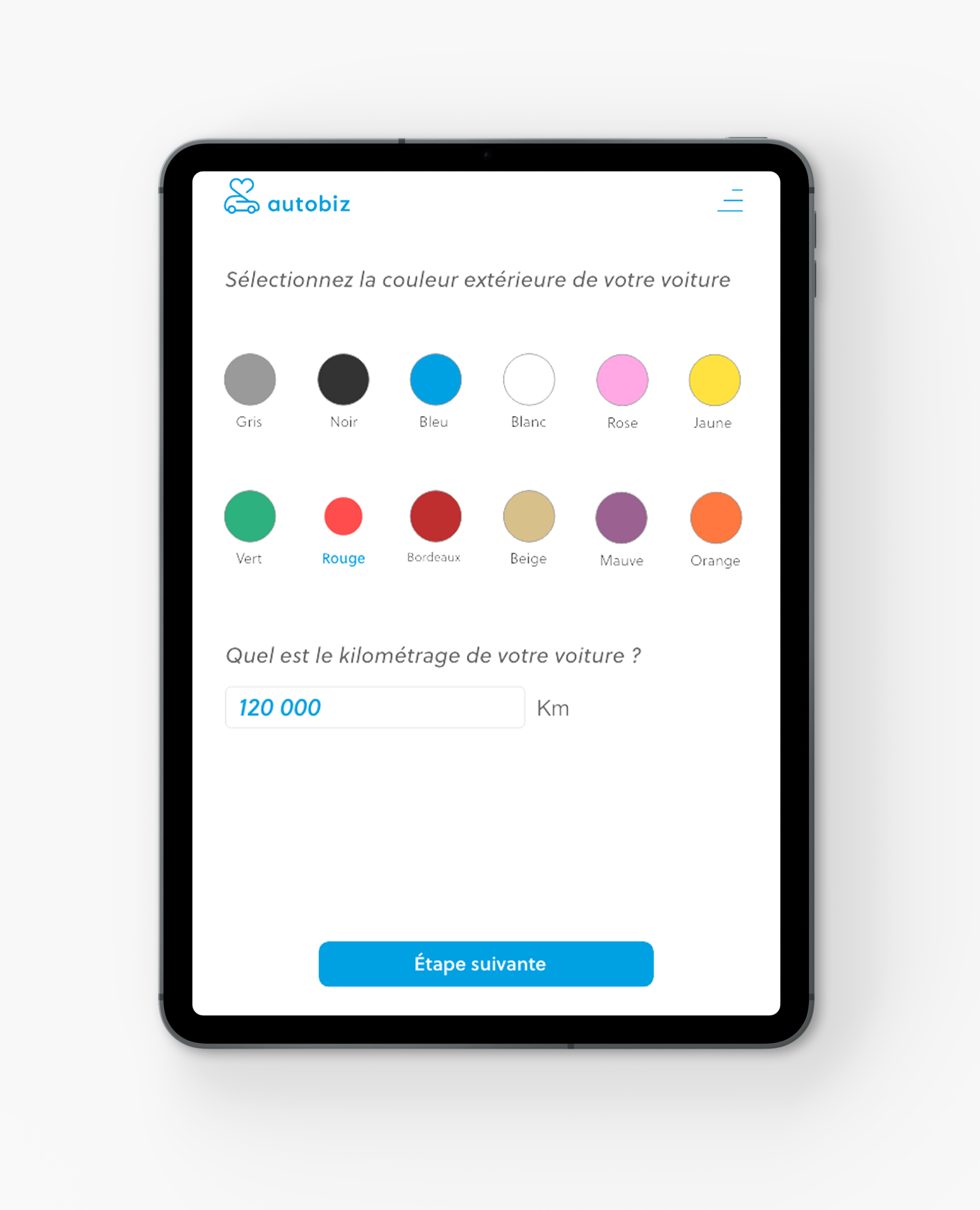
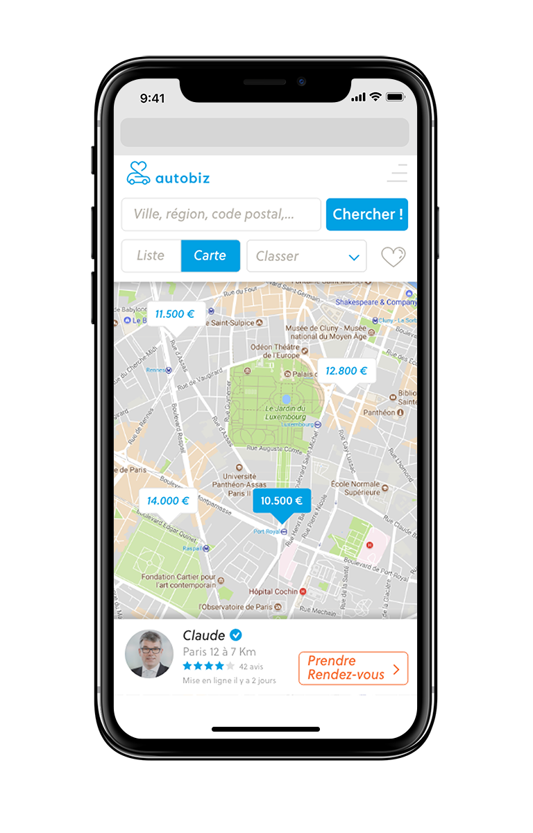
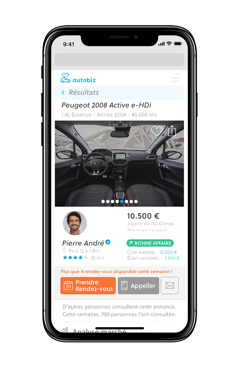
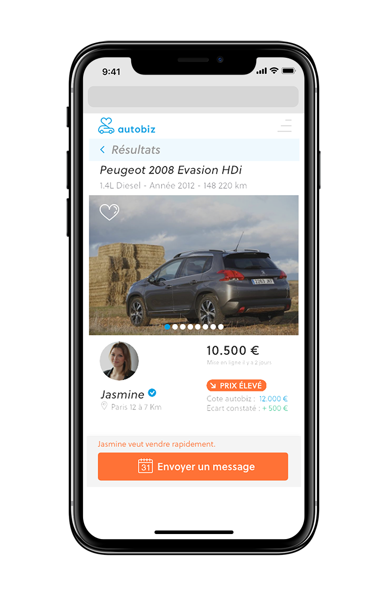
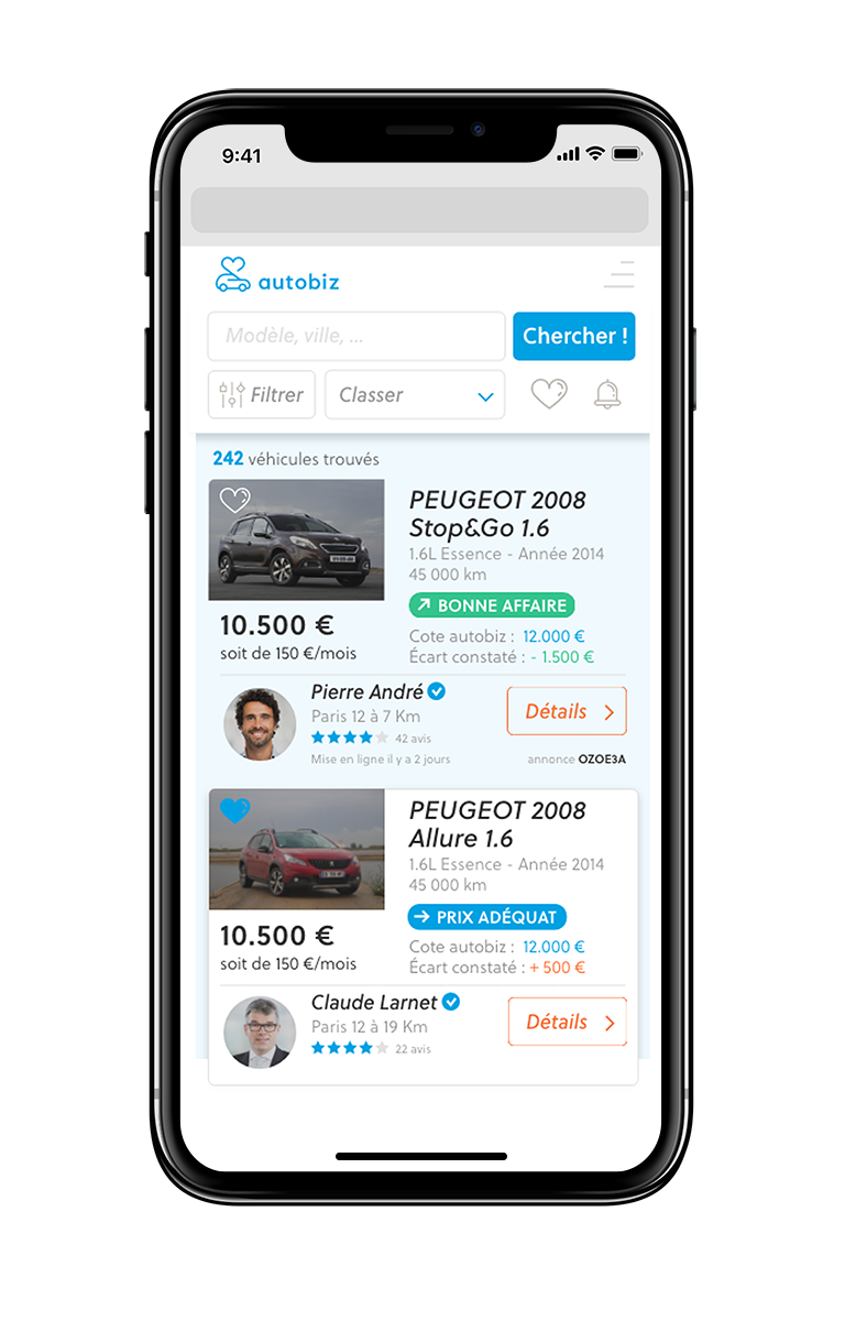
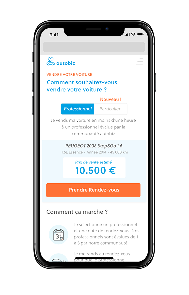
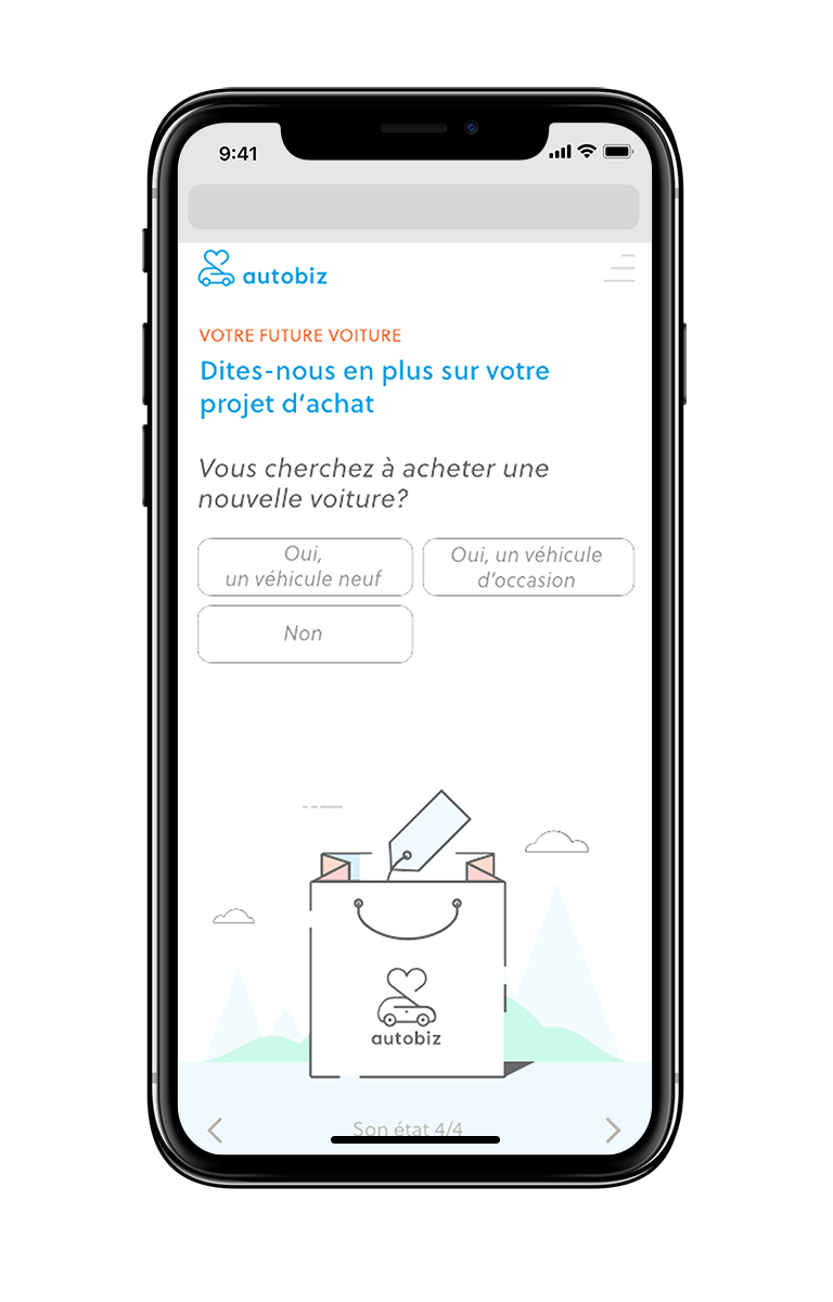
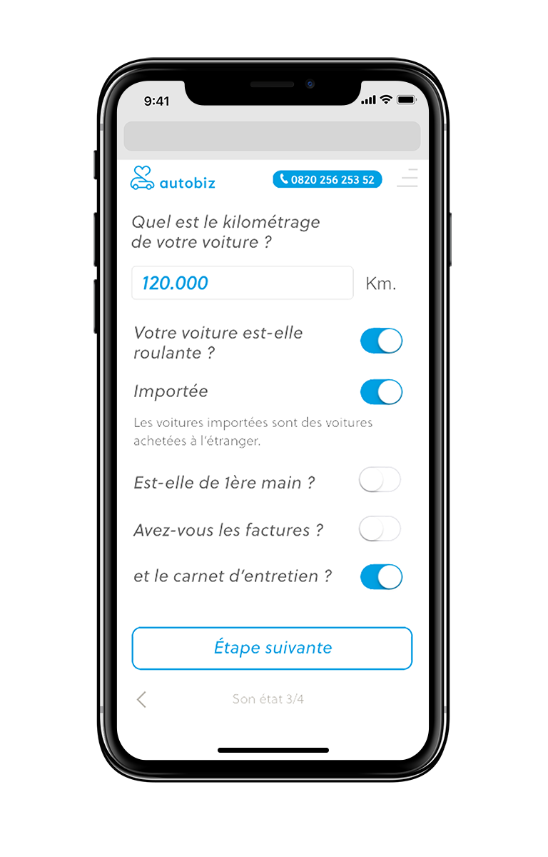
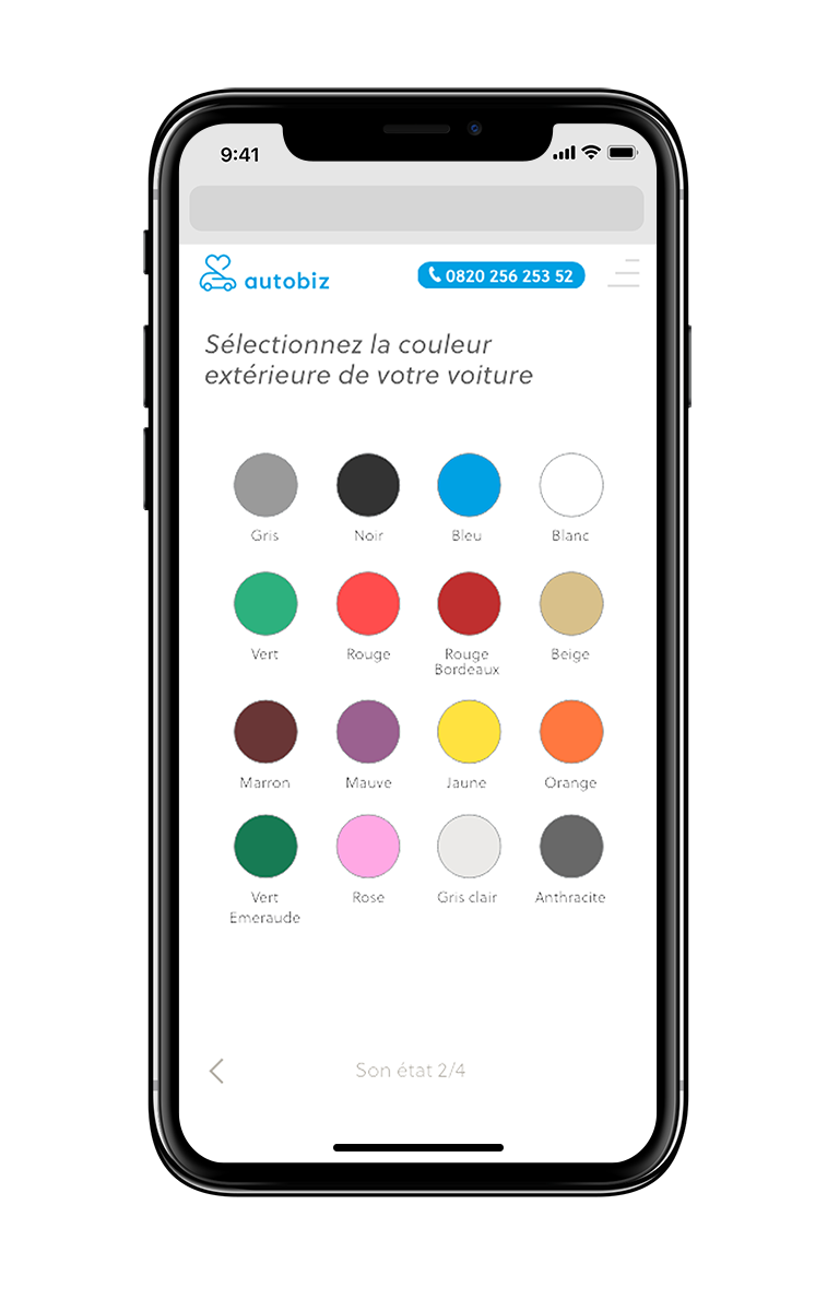
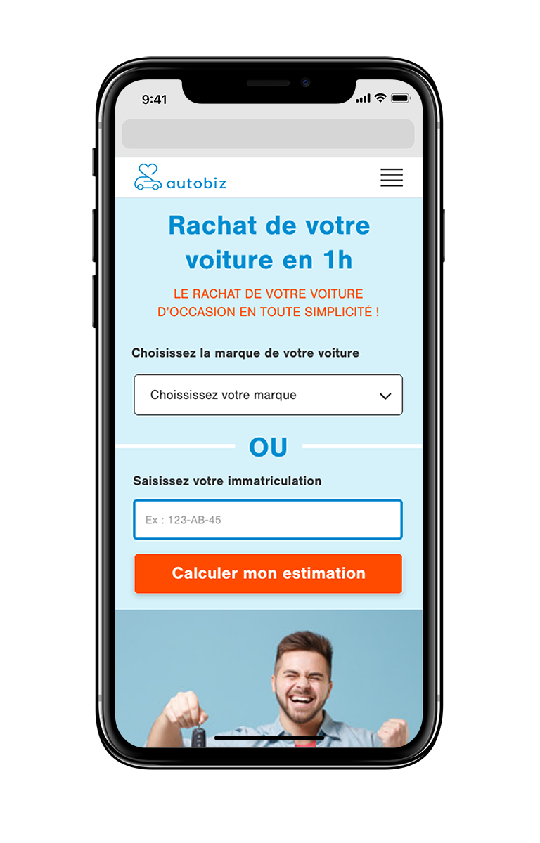
The user experience was designed to be simple, intuitive and playful, particularly on mobile and tablet devices. The interface prioritizes large interactive elements, clear call-to-action buttons and navigation optimized for touch interaction. A key feature is an interactive damage assessment tool, allowing users to mark scratches or dents directly on a vehicle diagram. This playful but functional system makes the valuation process both transparent and easy to understand.
PROJECT
autobiz Branding, Identity, Illustration, UI
ROLE
Art direction, UI design, Consulting
CLIENT
autobiz SA