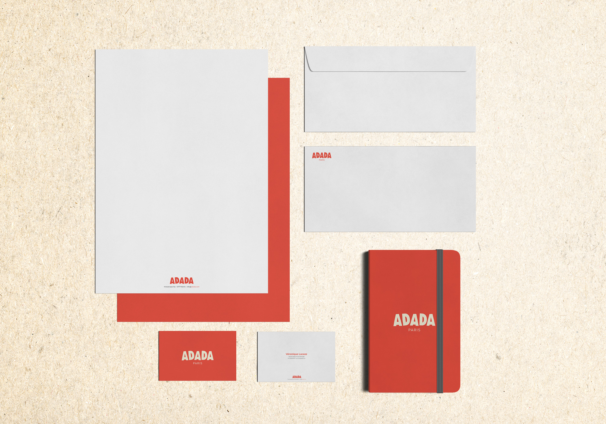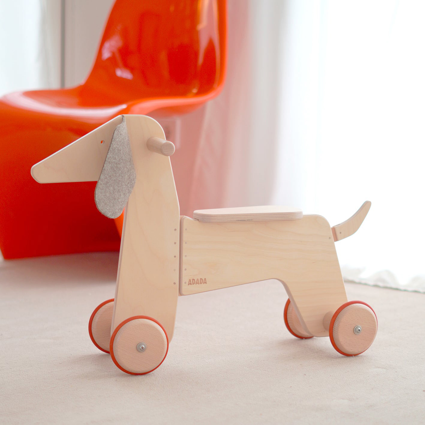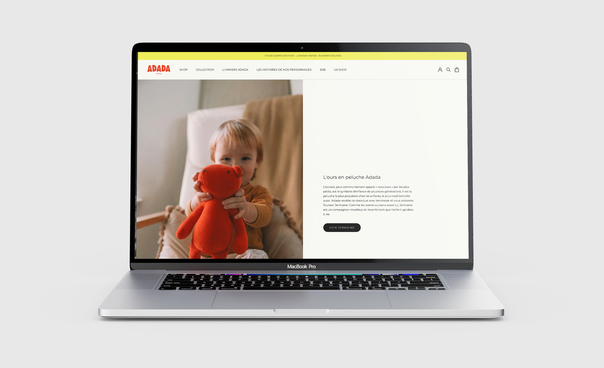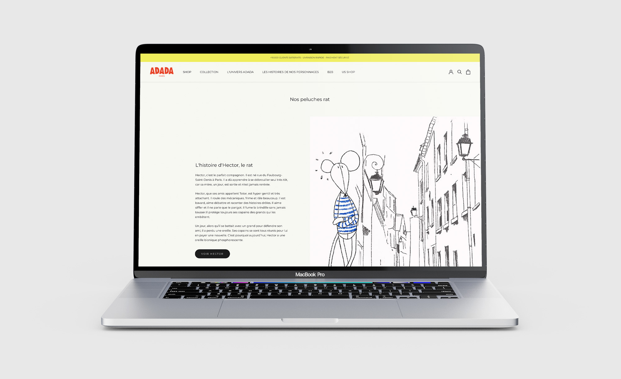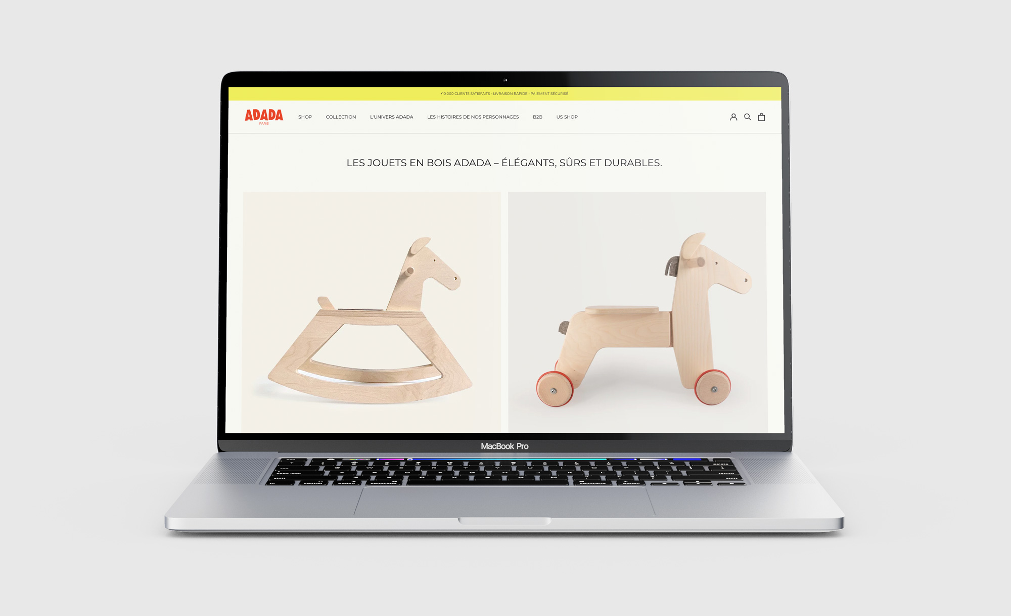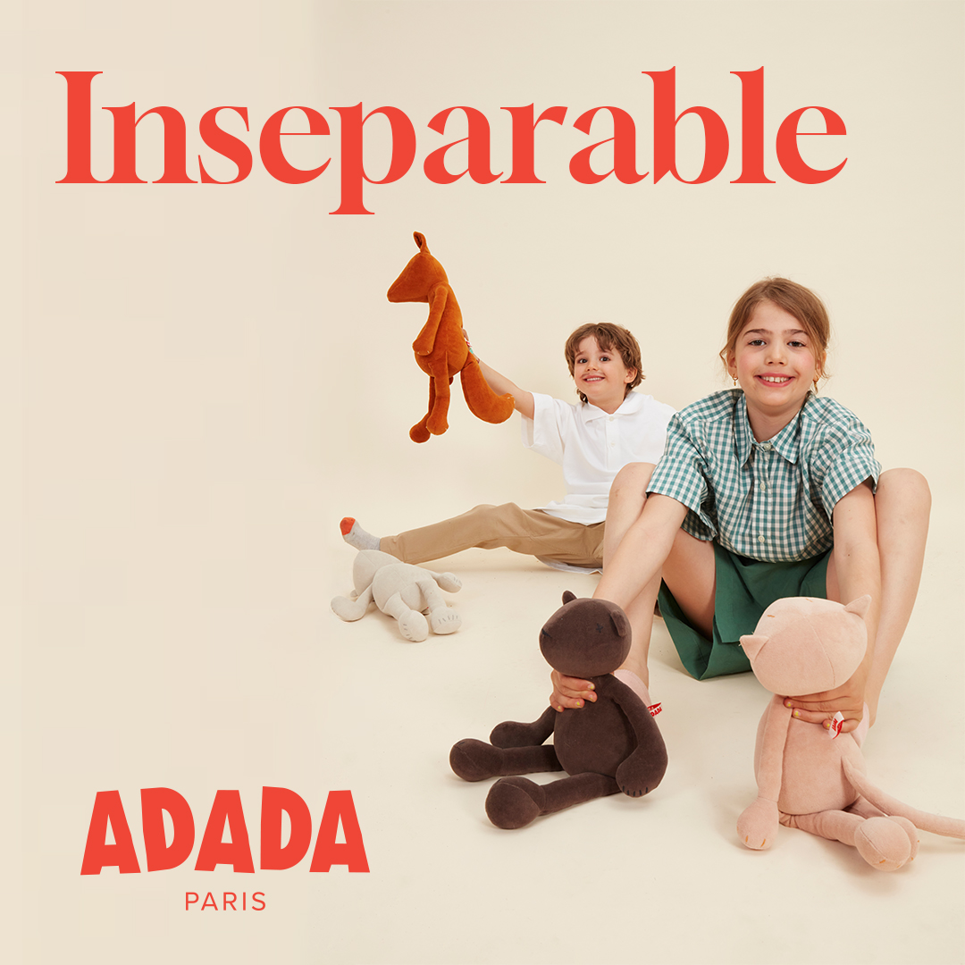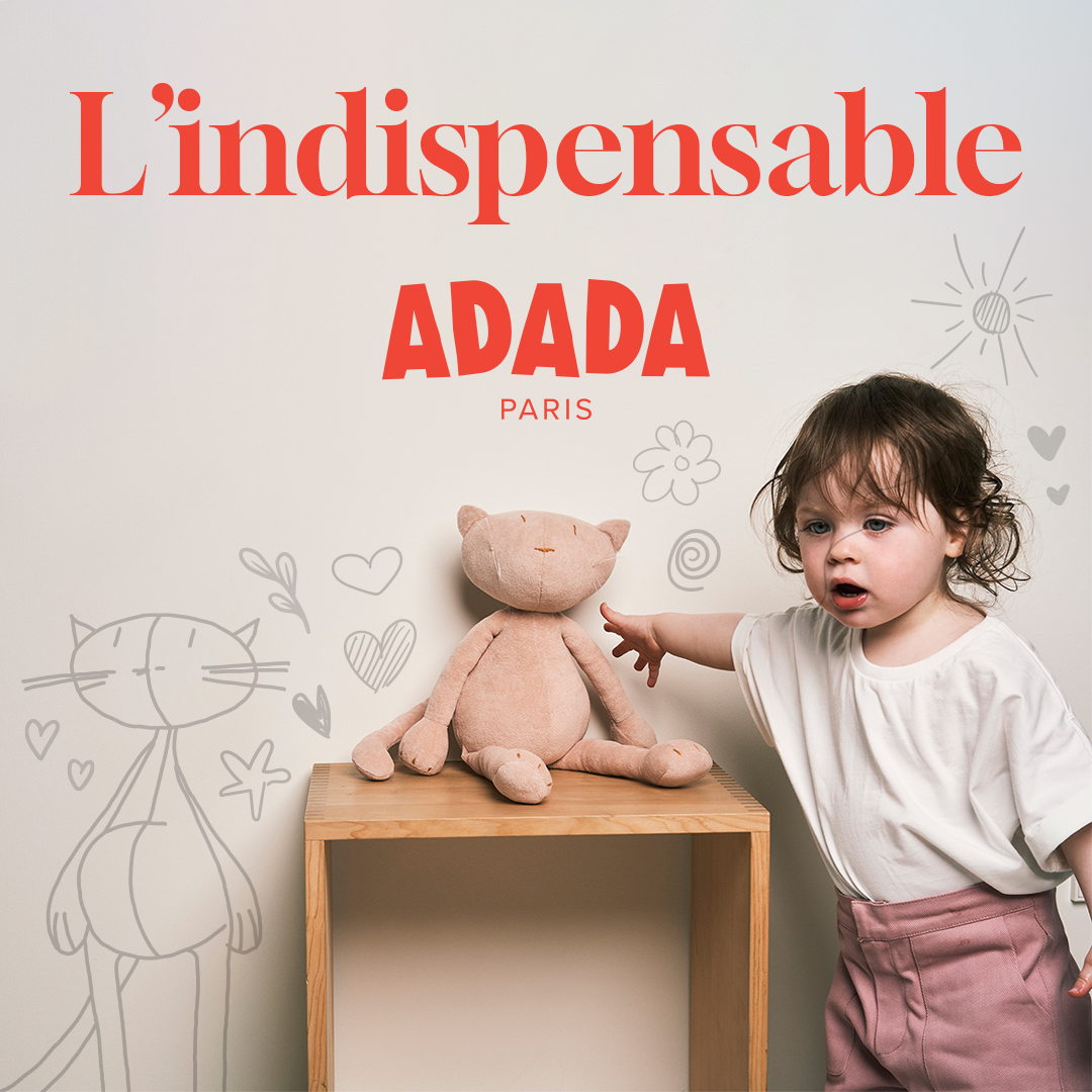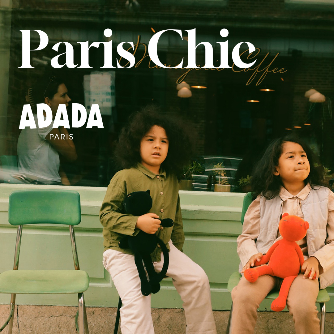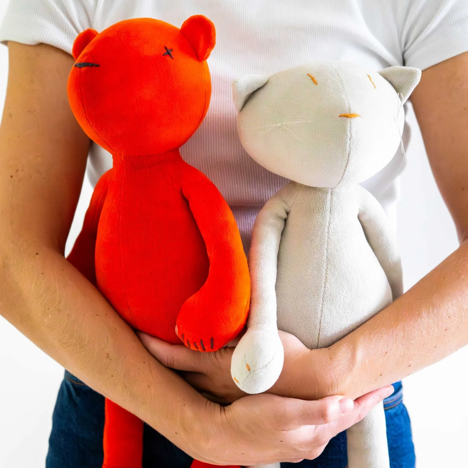
Adada Paris is a design house dedicated to children’s objects, best known for its high-end plush toys made in France and across Europe.
The brand develops a poetic and contemporary universe where each object is conceived both as a playful companion and as a decorative piece. Its approach combines minimalism, craftsmanship and sustainable materials, resulting in a timeless and refined aesthetic
Context
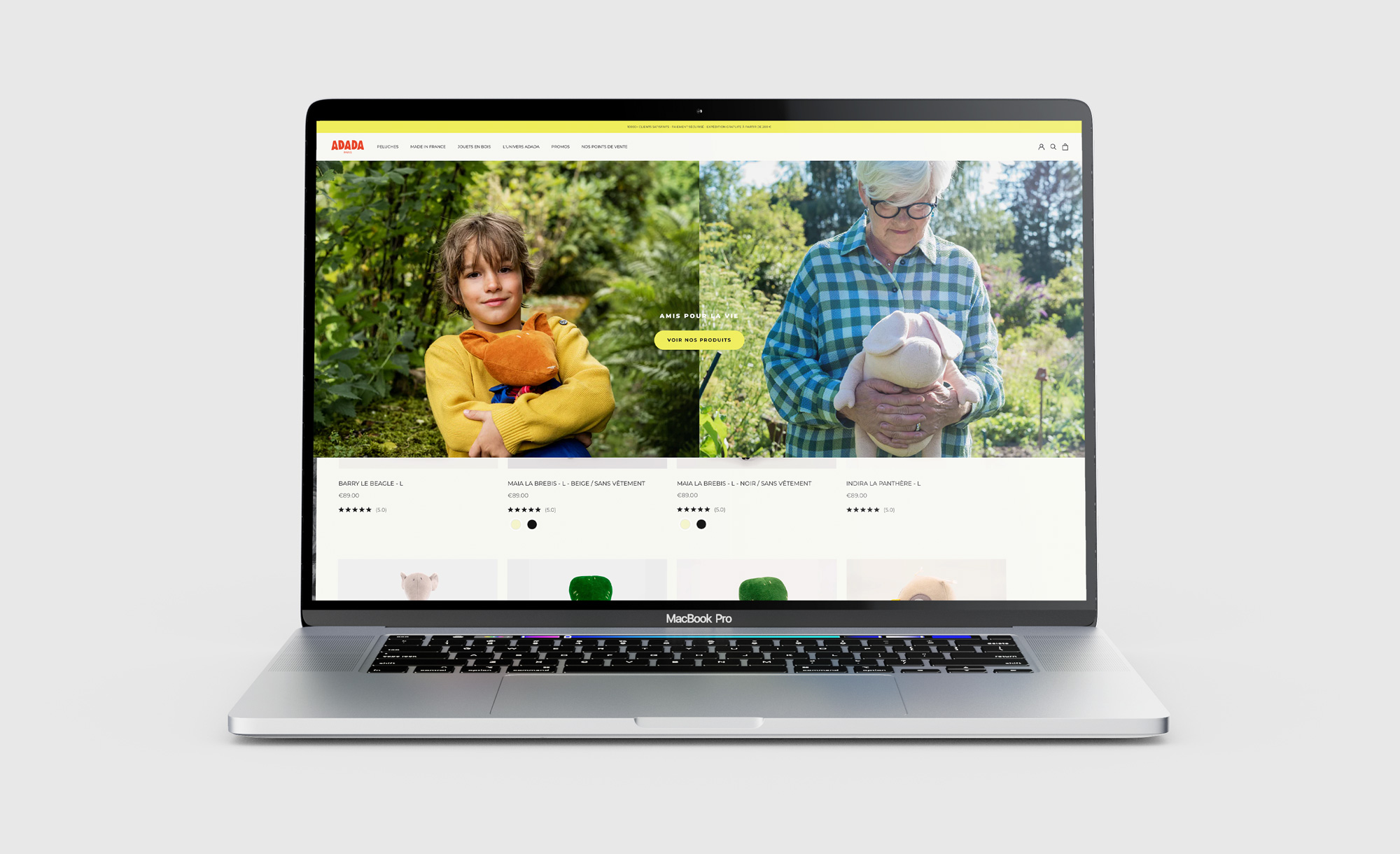
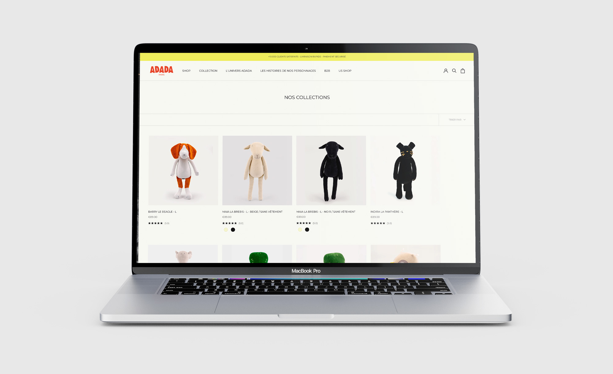
The visual identity needed to express the balance between a playful children’s universe and a premium positioning. The challenge was to create a graphic language capable of conveying softness and playfulness while maintaining a sober and contemporary aesthetic.
The client wanted a logotype that felt elegant, simple and adaptable, able to integrate naturally with different product designs and visual environments.
Logotype
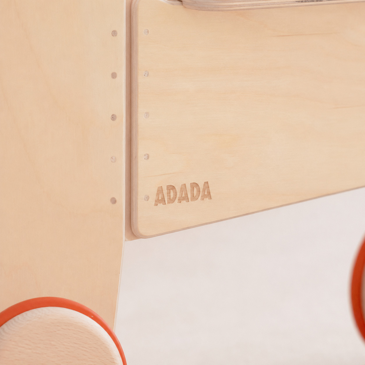
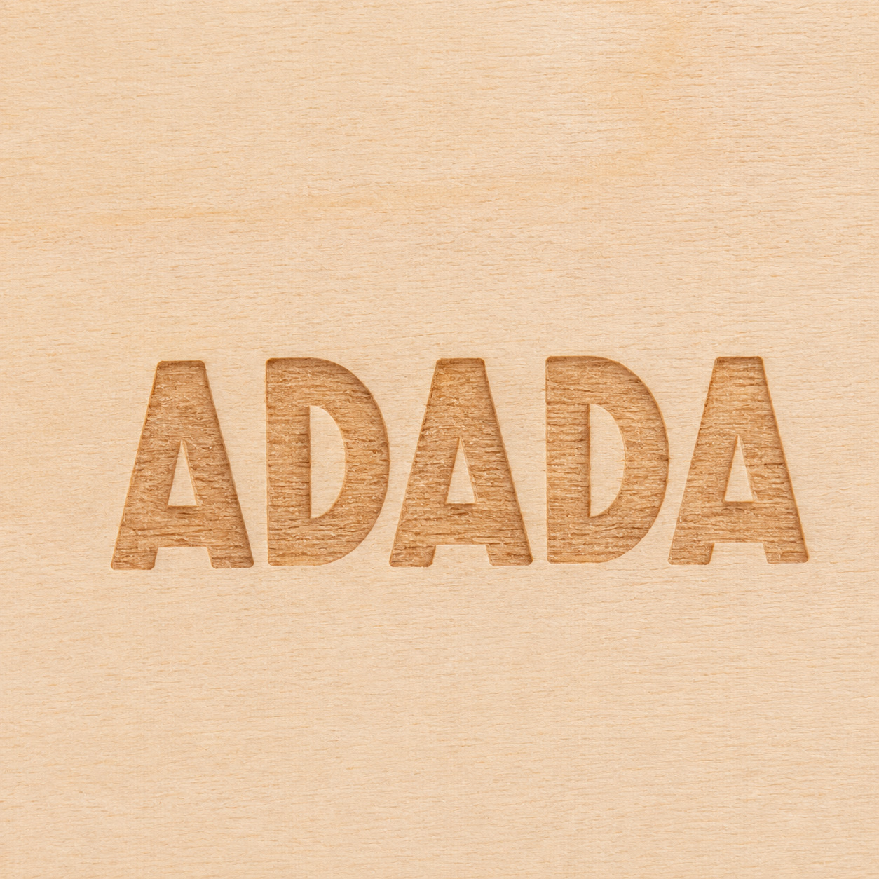
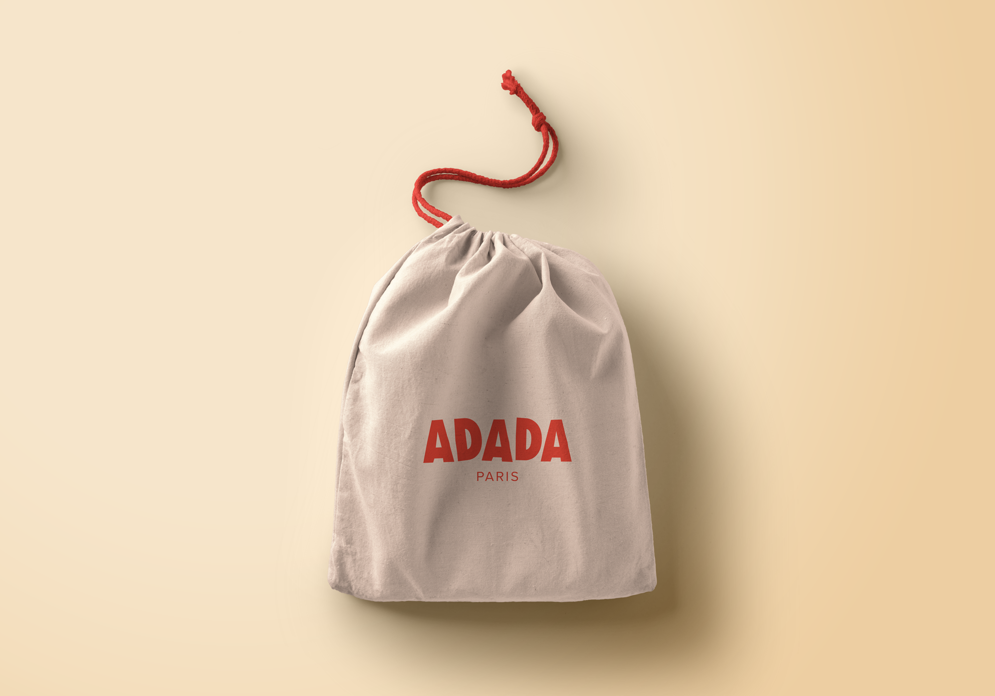
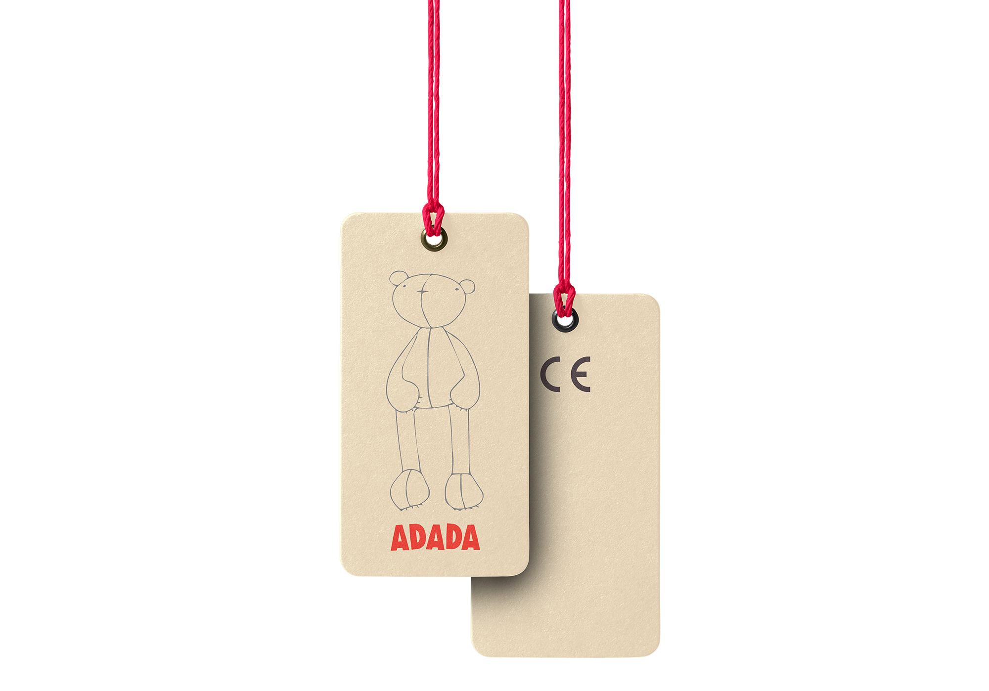
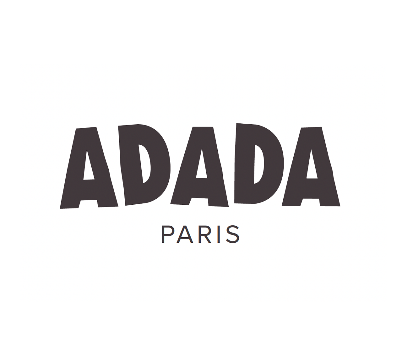
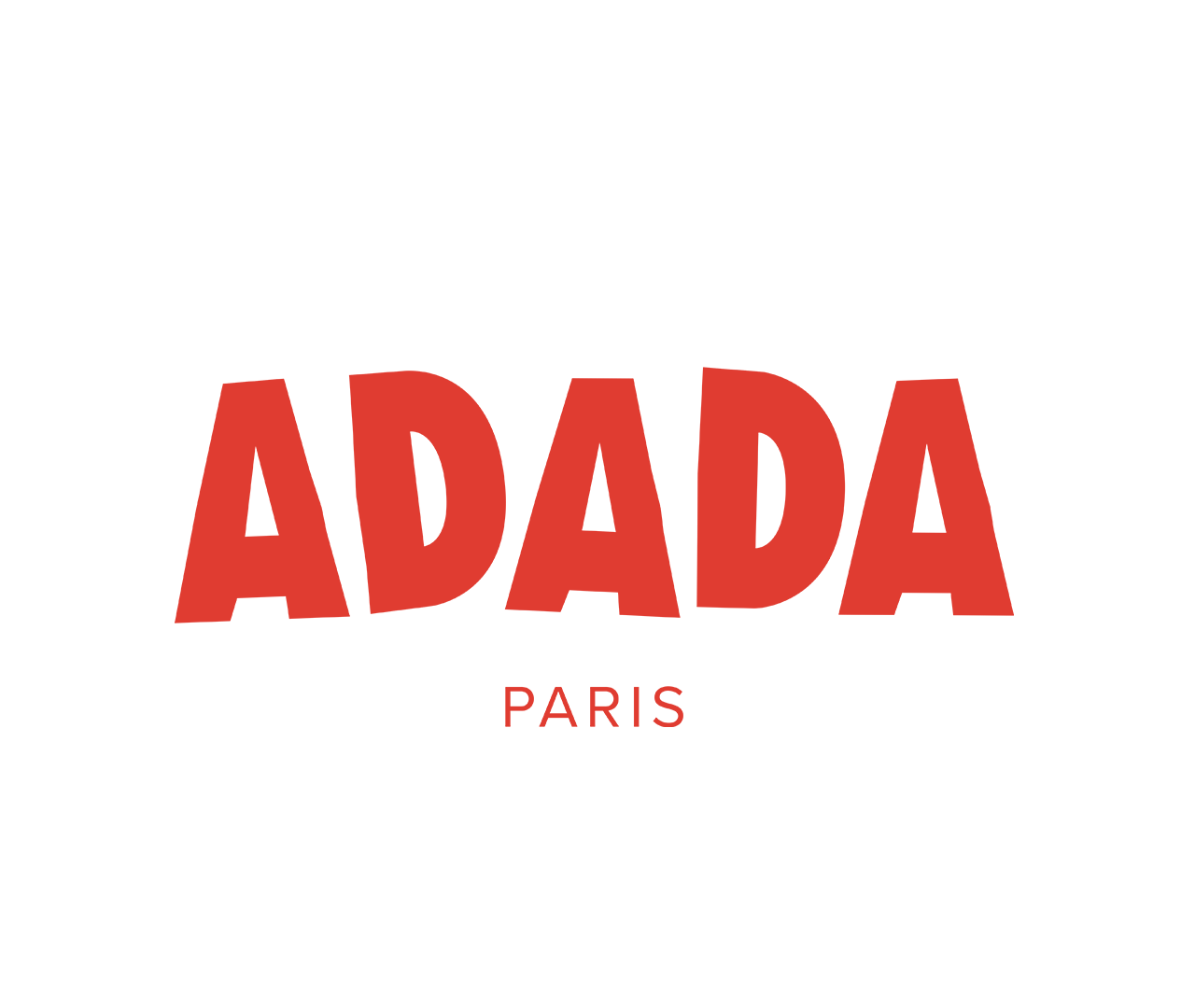
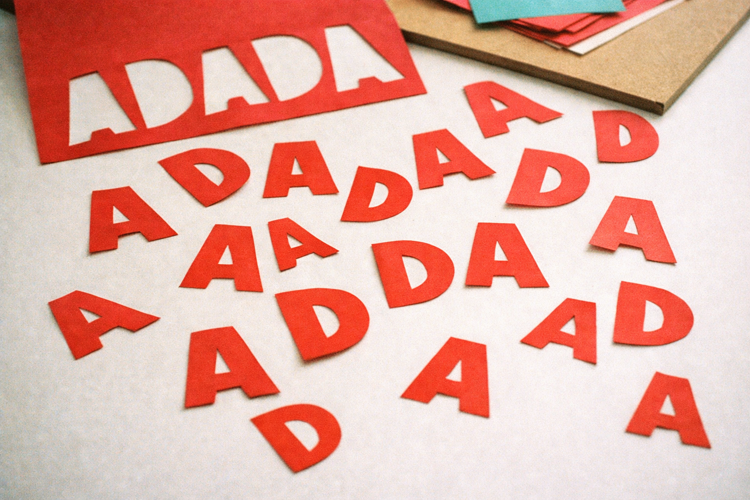
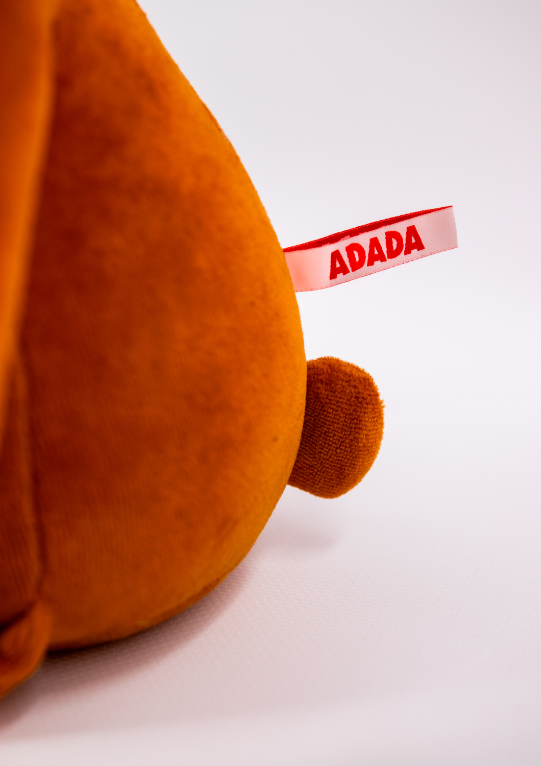
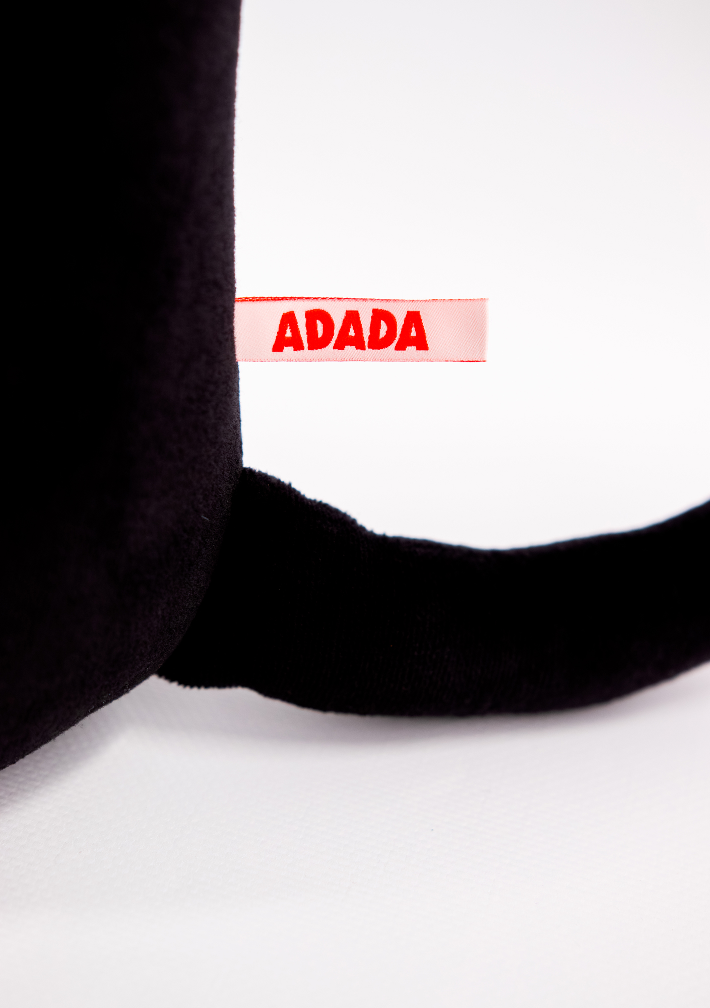
The logotype is based on a system of cut and recomposed letterforms, evoking the gesture of stamping or typographic collage. This construction introduces a subtle irregularity that adds rhythm and personality to a simple and repetitive word.
The result brings a playful and handcrafted quality, while maintaining a clean and distinctive graphic structure.
The logotype is based on a system of cut and recomposed letterforms, evoking the gesture of stamping or typographic collage. This construction introduces a subtle irregularity that adds rhythm and personality to a simple and repetitive word.
The result brings a playful and handcrafted quality, while maintaining a clean and distinctive graphic structure.
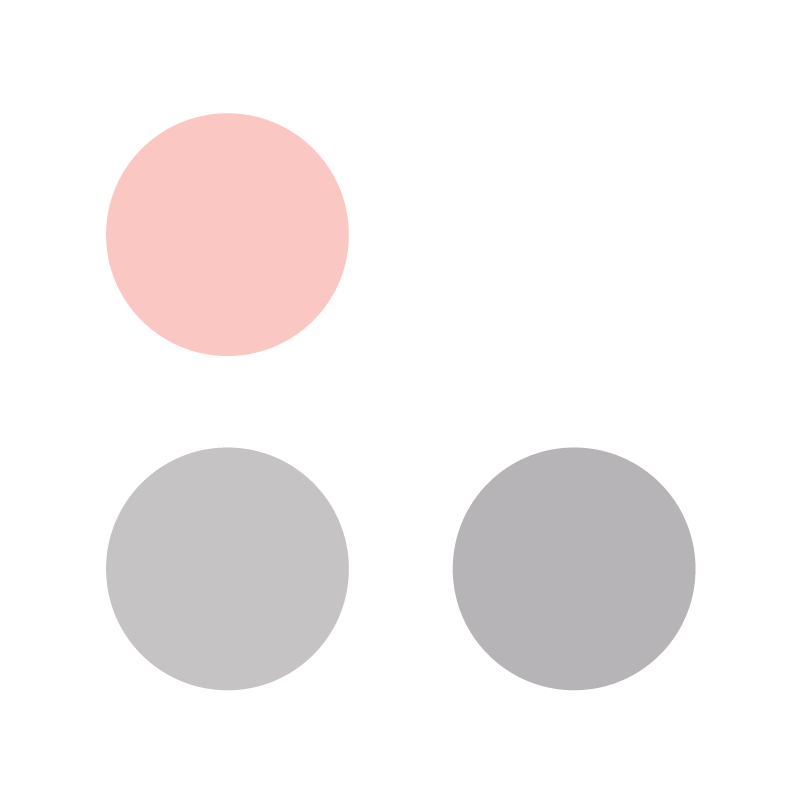
Color
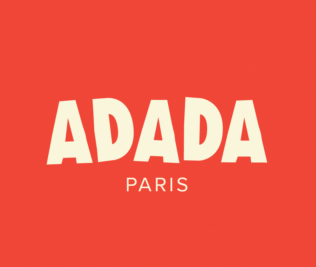
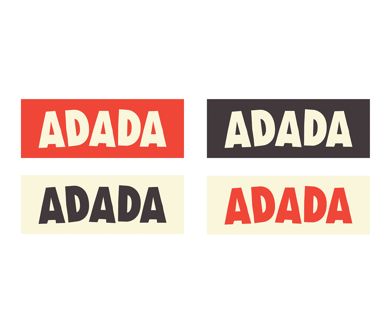
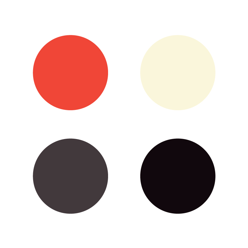
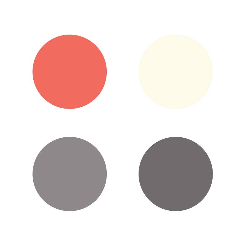
The color palette is built around a red tone inspired by the brand’s iconic teddy bear, combined with softer and more pastel tones.
This contrast creates a balance between the softness of a children’s universe and the visual impact of red, bringing warmth, visibility and character to the identity.
PROJECT
Identity and branding
ROLE
Art Director
CLIENT
Adada
Typography
The typographic system responds to a constraint expressed by the client: using typefaces available through Google Fonts. The combination of geometric and functional typefaces creates a clear hierarchy while ensuring high readability and ease of use across all communication materials.