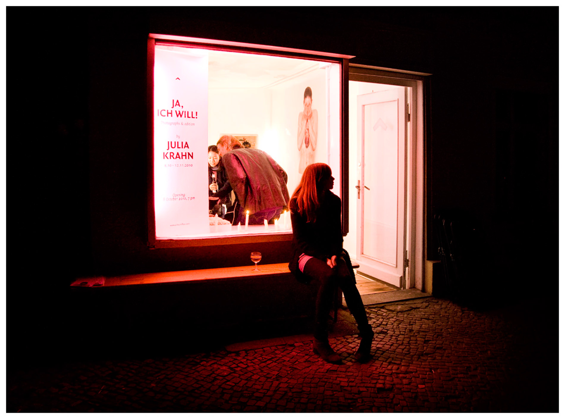

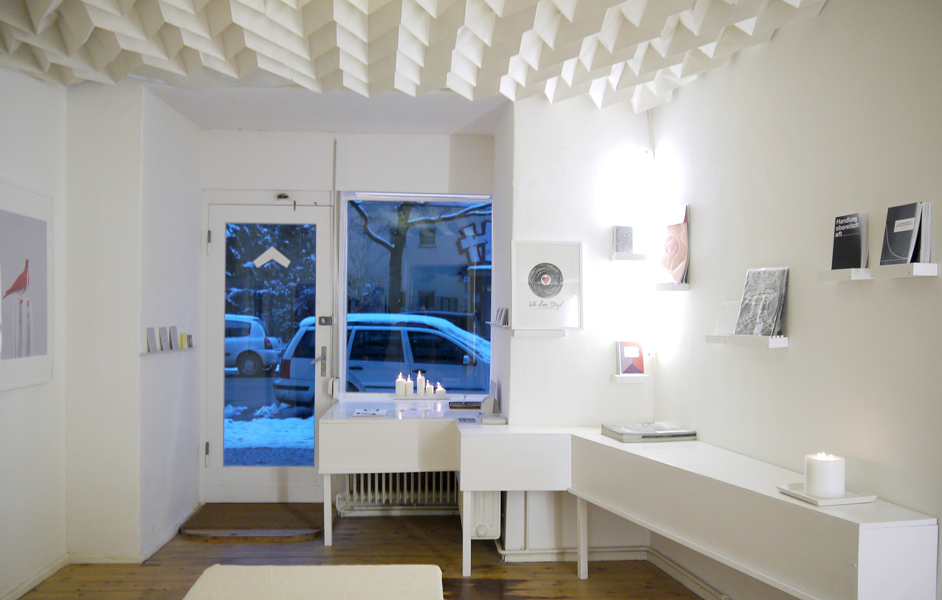
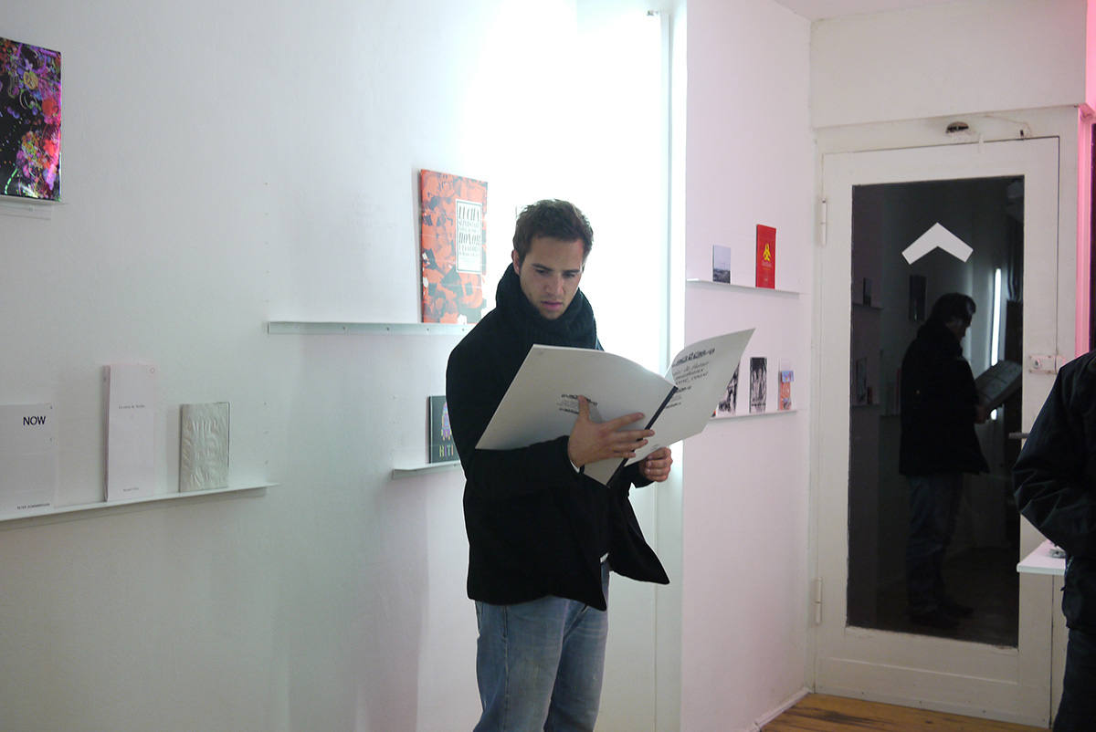
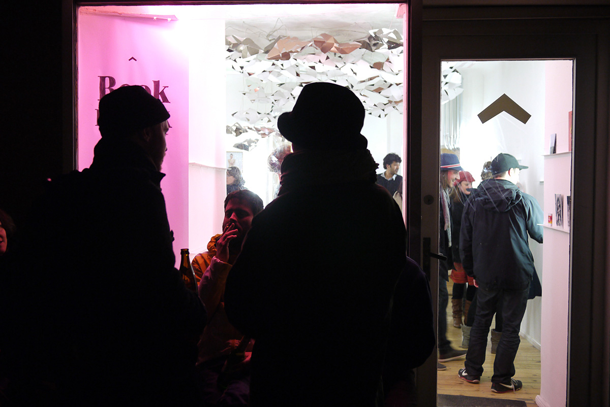
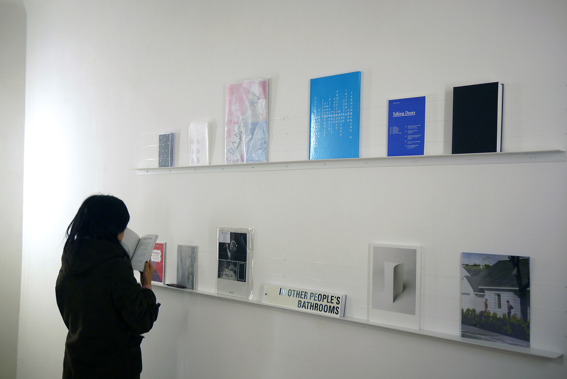
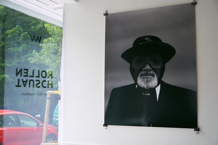
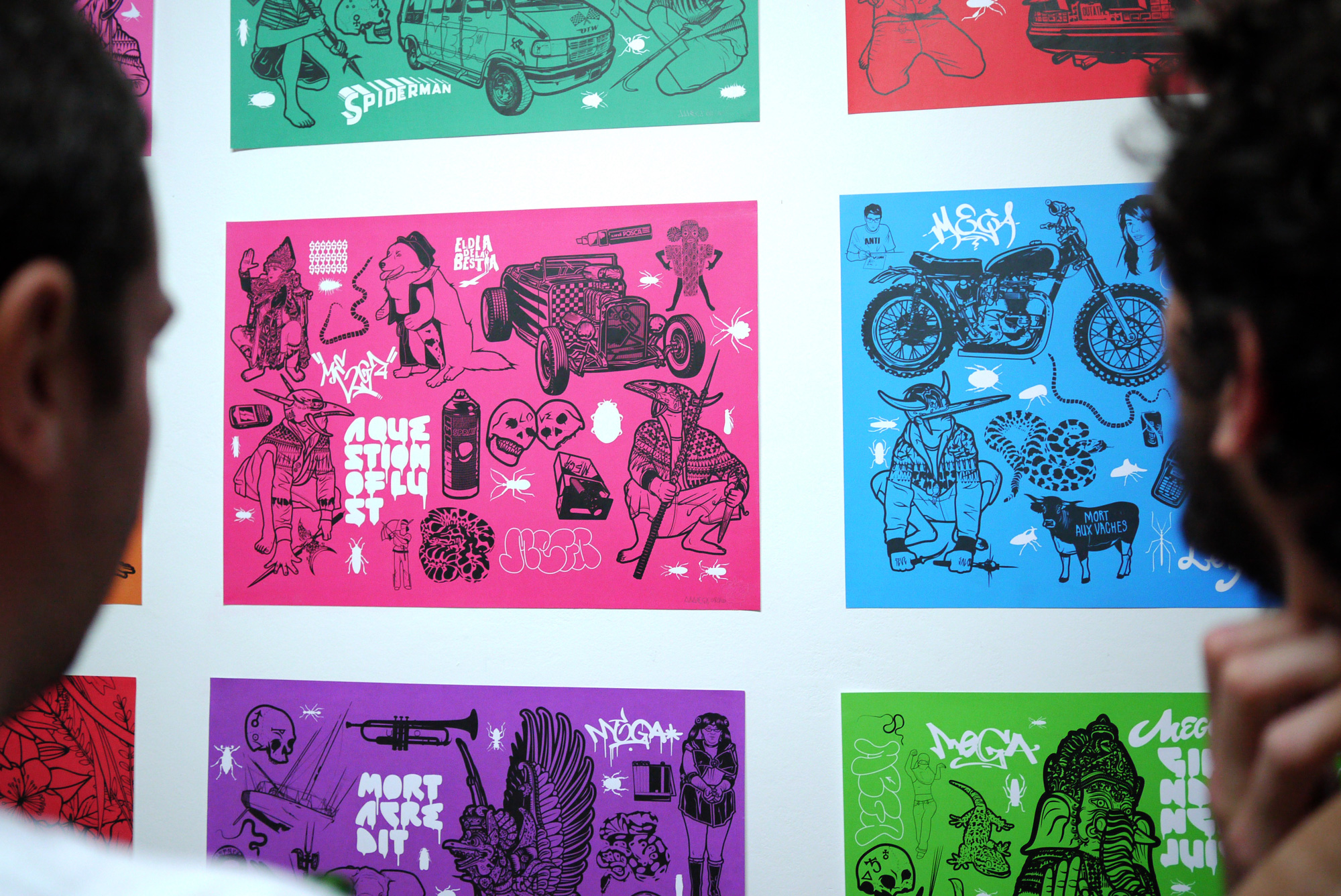
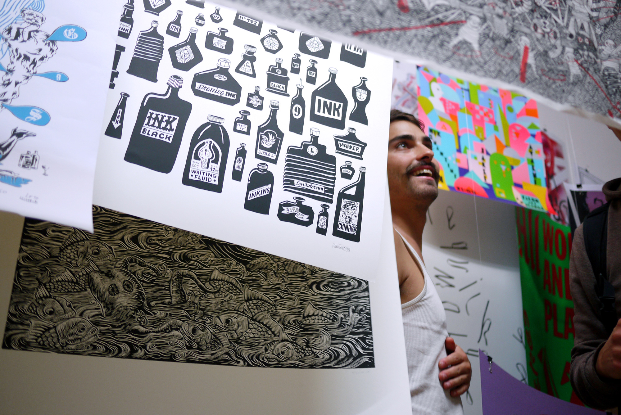
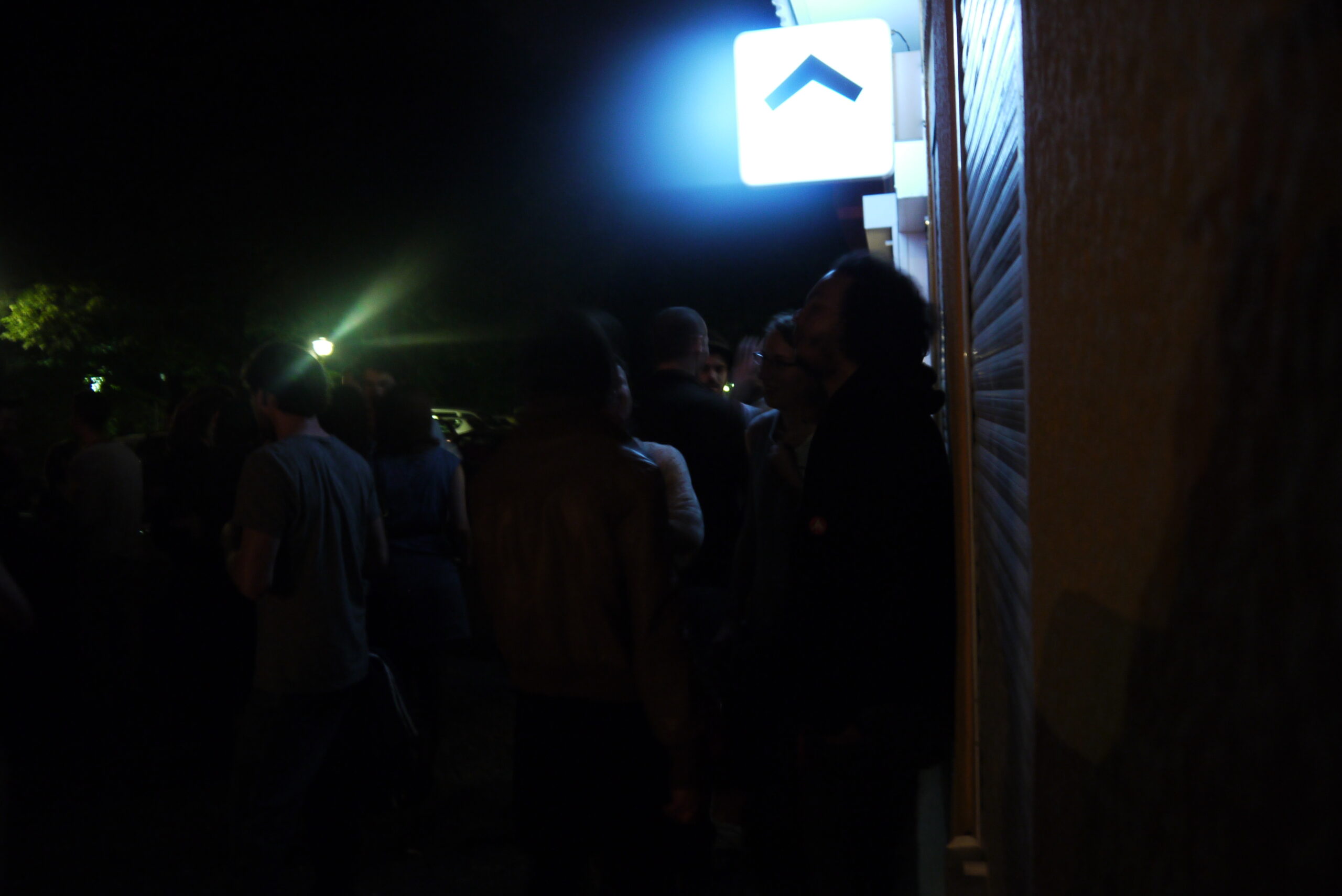
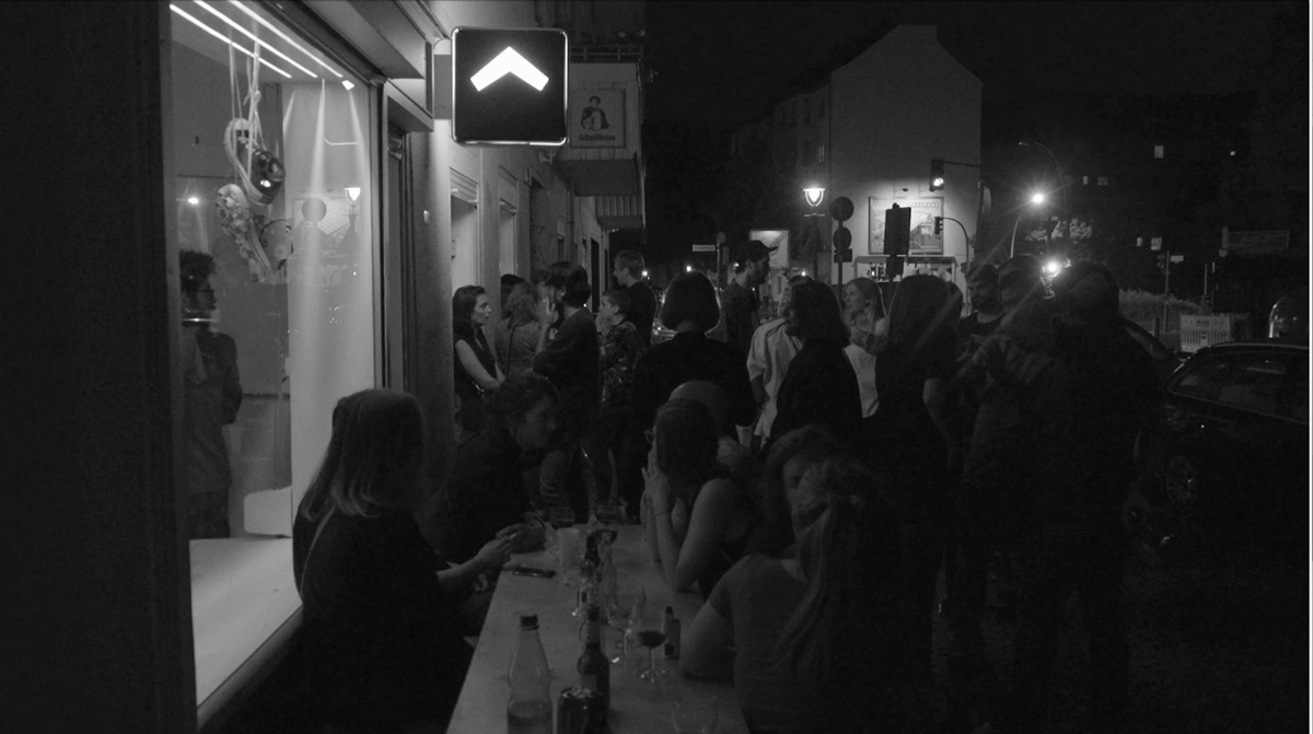
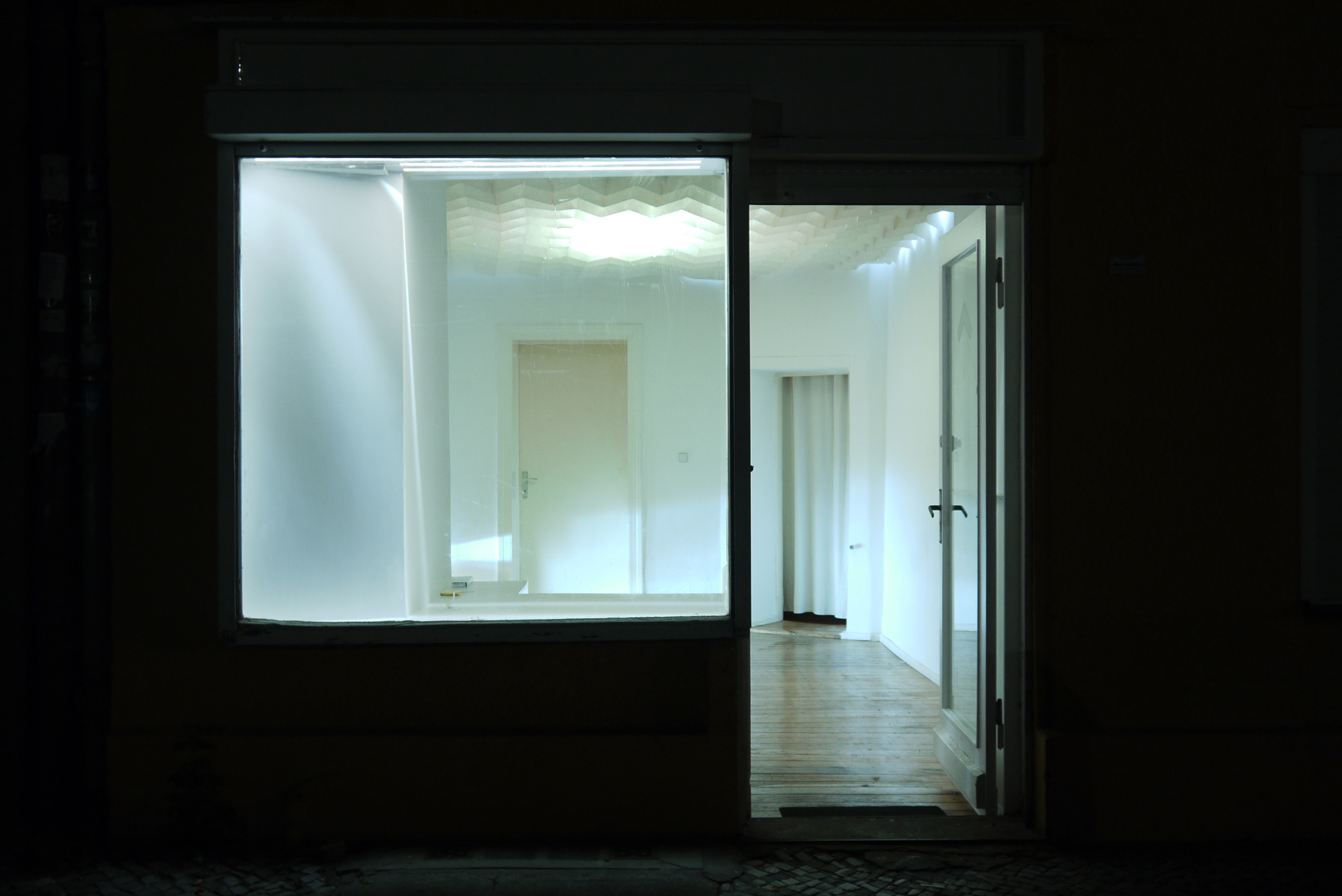
Zirkumflex was a graphic design studio and independent art gallery that I co-founded in Berlin in 2007 with Brice Delarue. Active until 2018, the project operated at the intersection of graphic design, visual culture and artistic research.
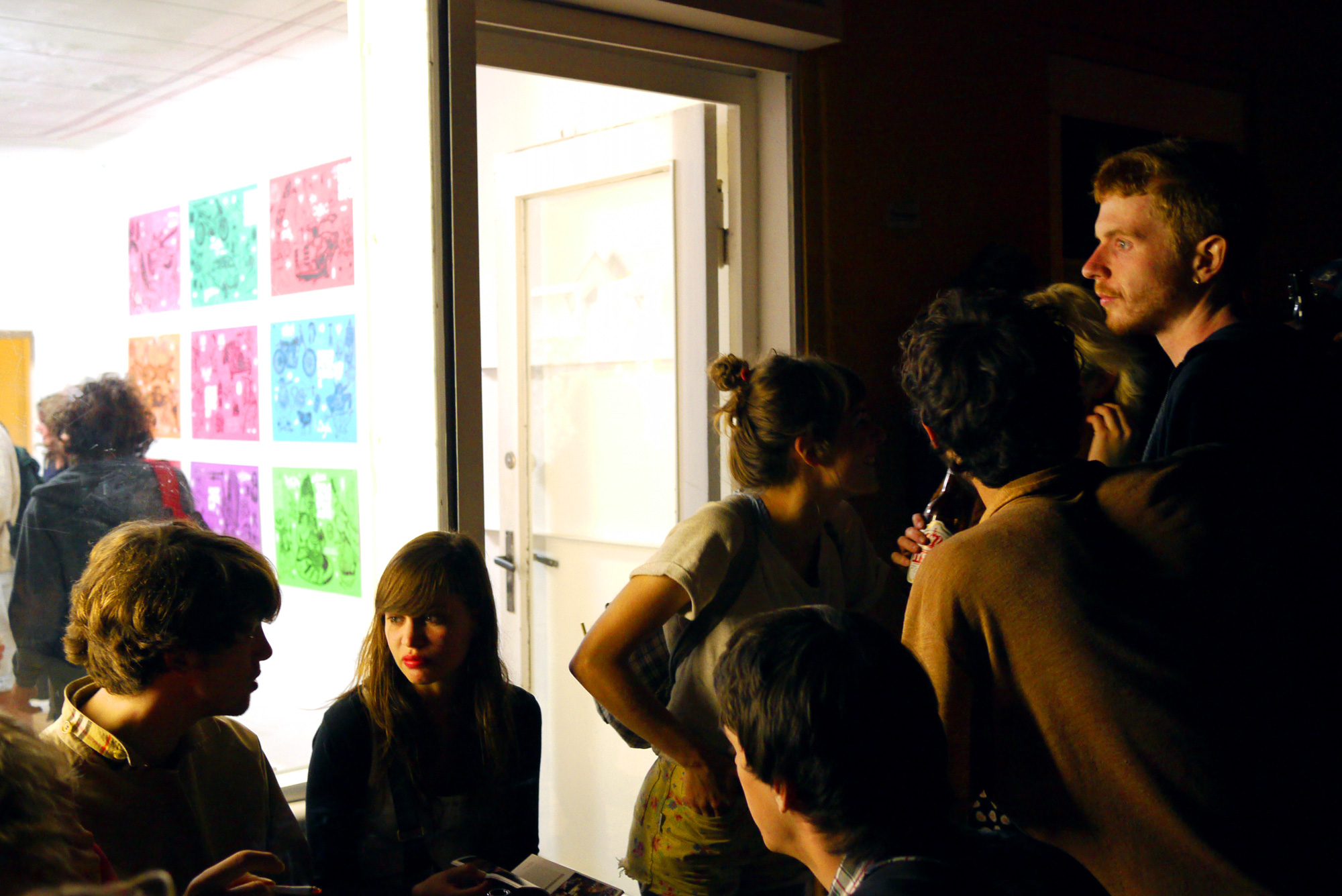
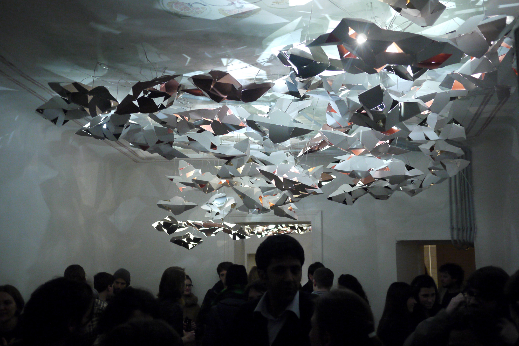
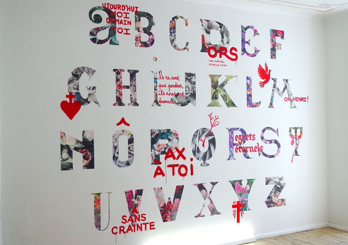
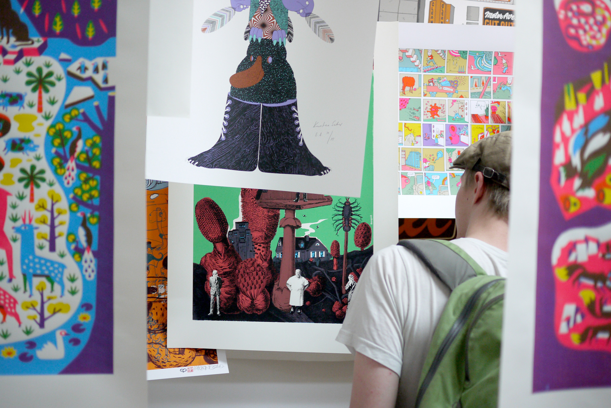
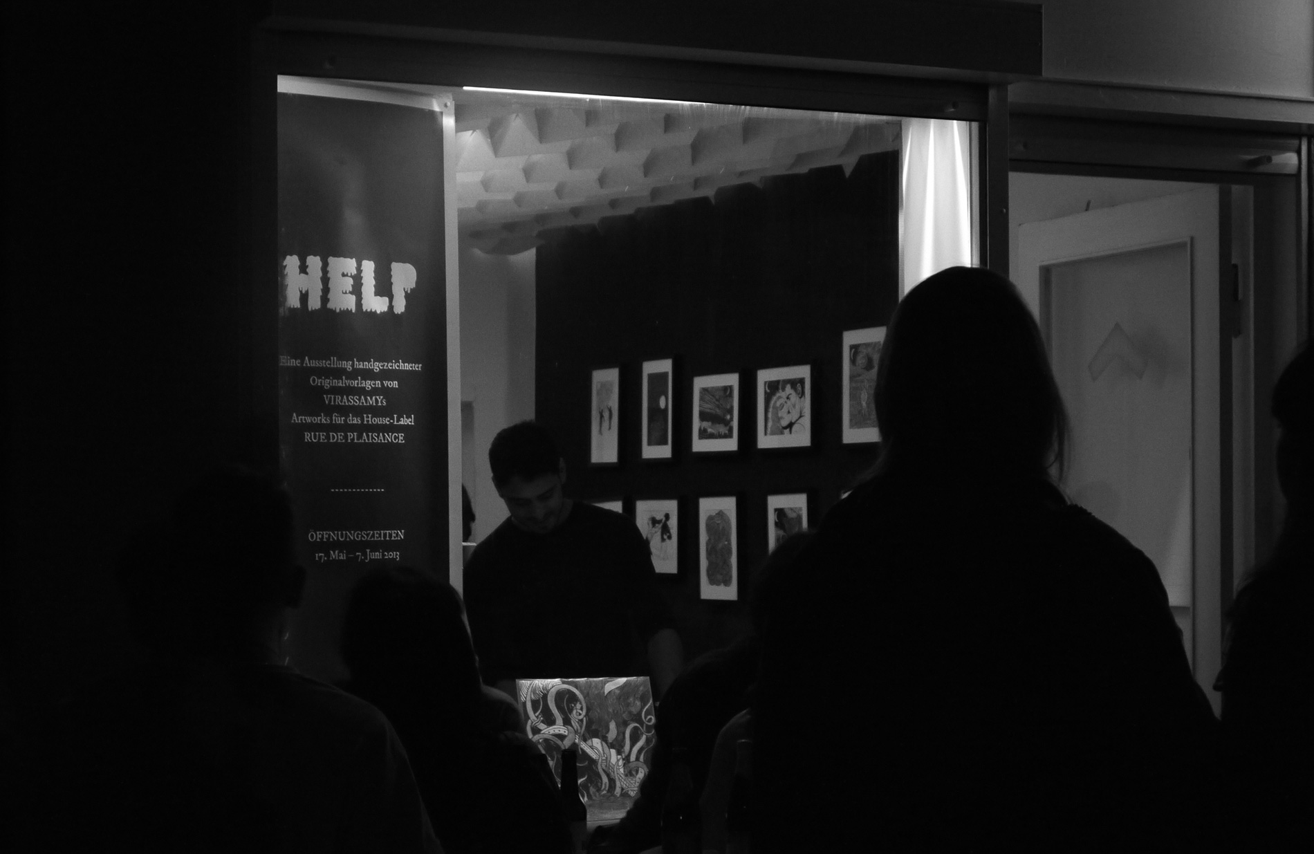
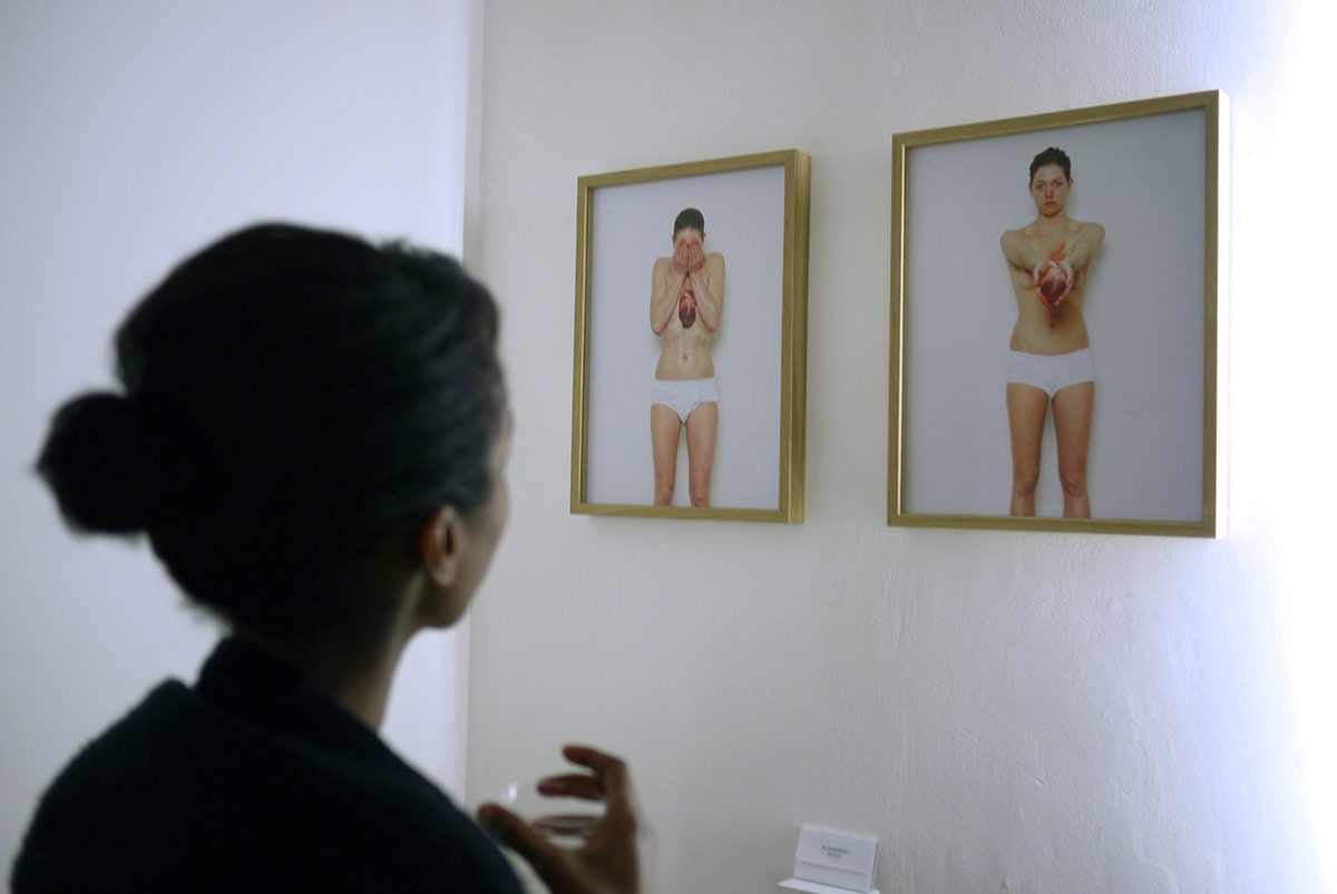
The studio developed projects across visual identity, editorial design, typography and spatial graphic design, working with cultural institutions, artists and independent initiatives. At the same time, Zirkumflex functioned as a small exhibition space hosting installations, performances and exhibitions.
This hybrid structure — both design studio and curatorial platform — created a space for dialogue between graphic design, contemporary art and experimental visual practices.
Problem
The visual identity needed to reflect the hybrid nature of the project: both a professional design studio and an independent cultural space.
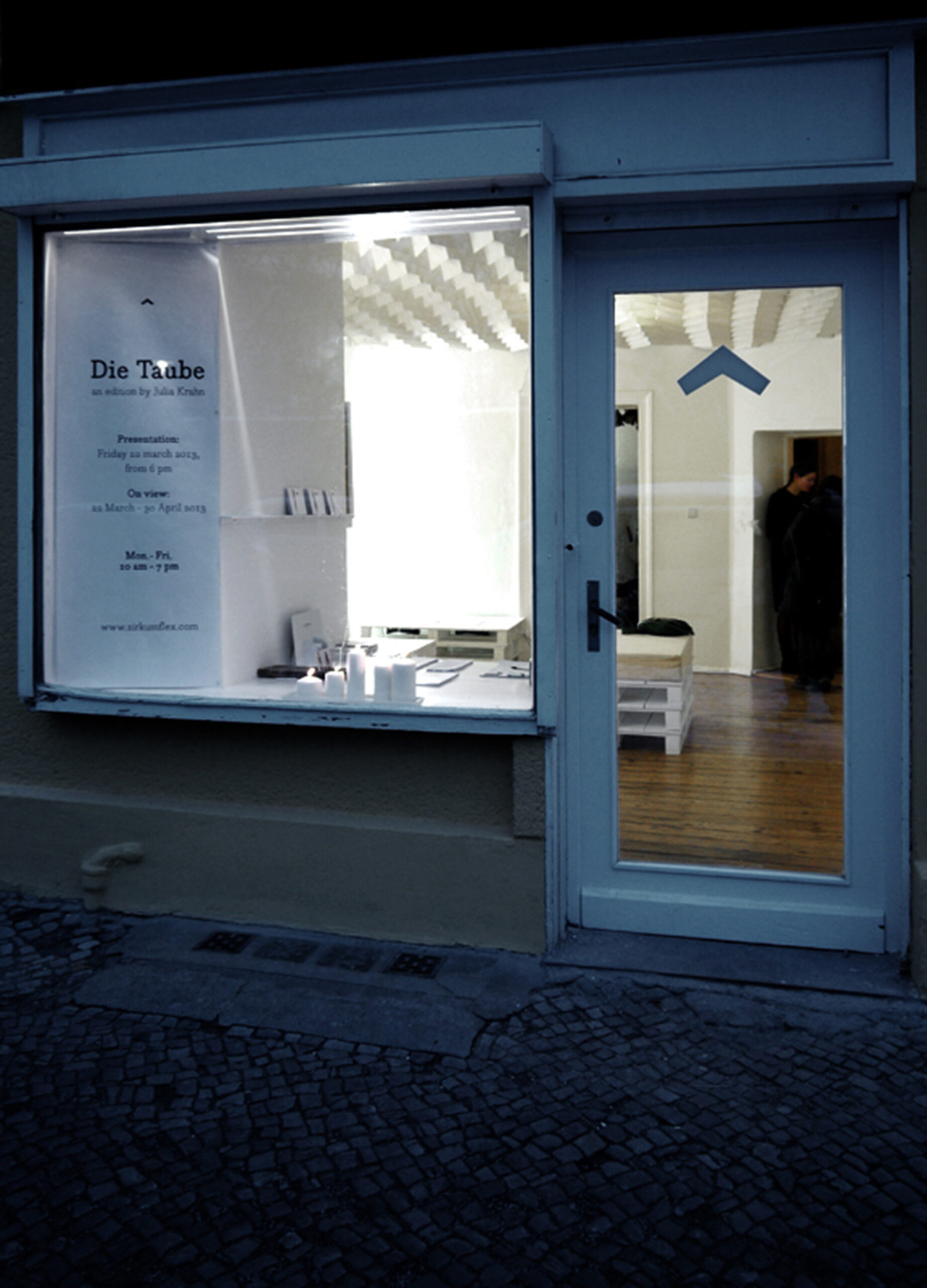
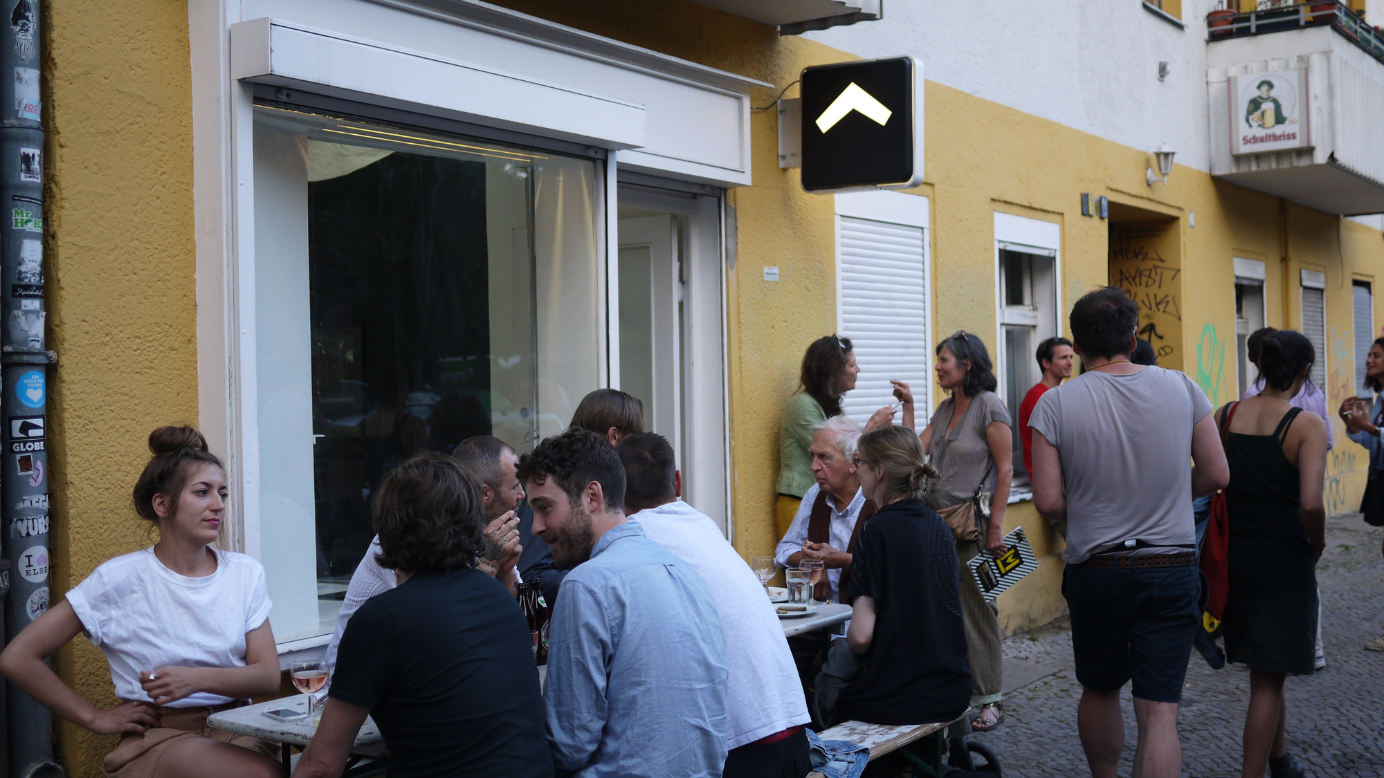
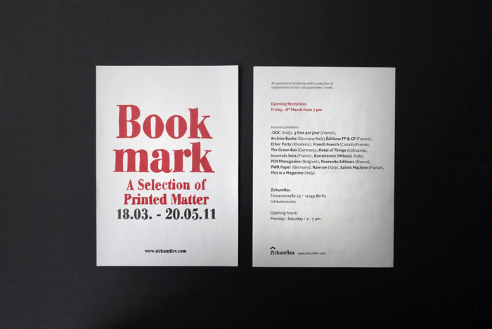
The challenge was to develop an identity system capable of working across very different contexts — editorial design, studio communication, exhibition graphics and architectural signage — while remaining minimal, coherent and adaptable.
The identity also had to remain discreet enough to support and highlight the projects presented rather than dominate them.






Logotype
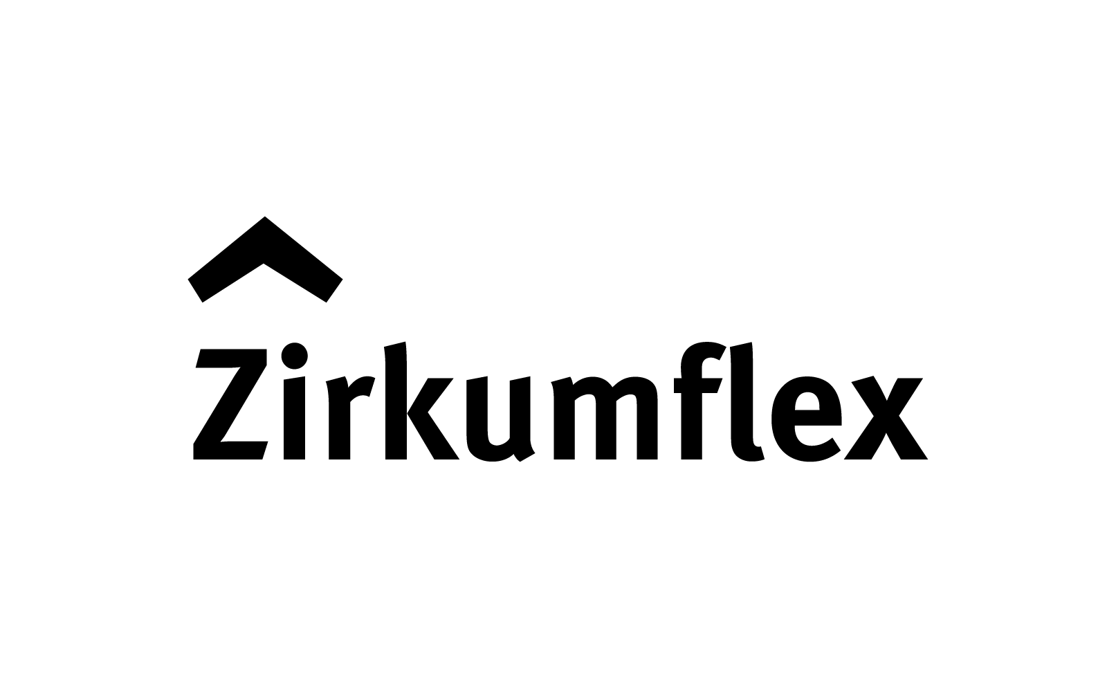
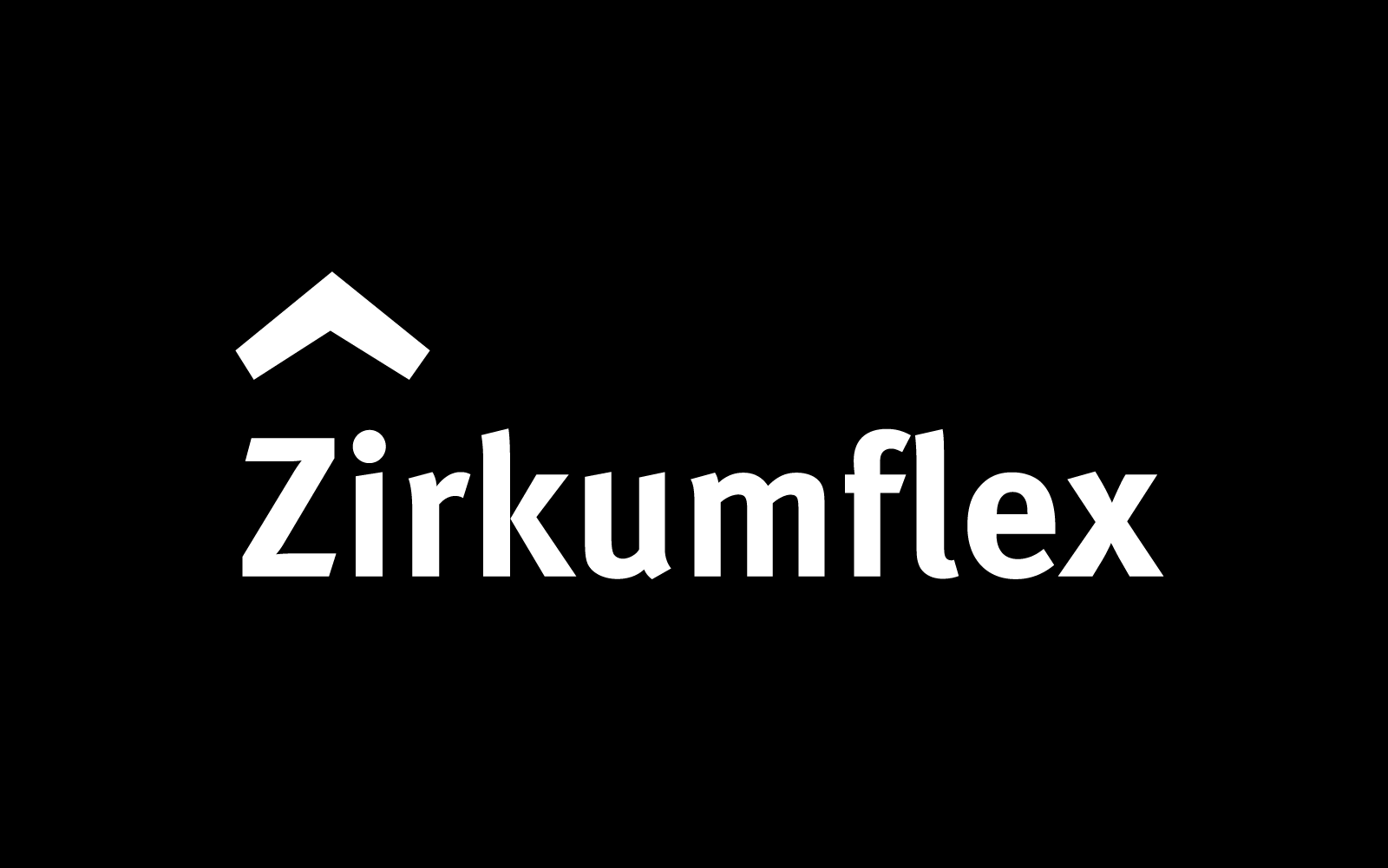
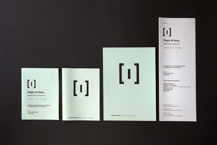
The logotype is built around an angular symbol referencing the circumflex accent, directly echoing the name Zirkumflex. In language, the circumflex modifies the tone of a letter, introducing nuance and emphasis. The symbol translates this idea into a graphic gesture: a minimal intervention that subtly alters perception.
Formally, the sign can also be interpreted as a roof, evoking the idea of a house — a place of proximity, gathering and exchange. This metaphor reflects the spirit of the studio and gallery, conceived as a welcoming space for artists, designers and visitors.
The mark therefore functions as a simple and recognizable graphic element, capable of operating as a logo, symbol or spatial marker.
Typography
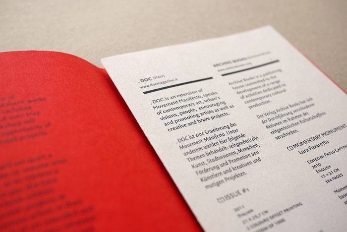
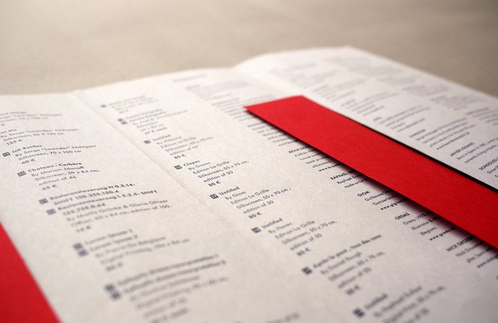
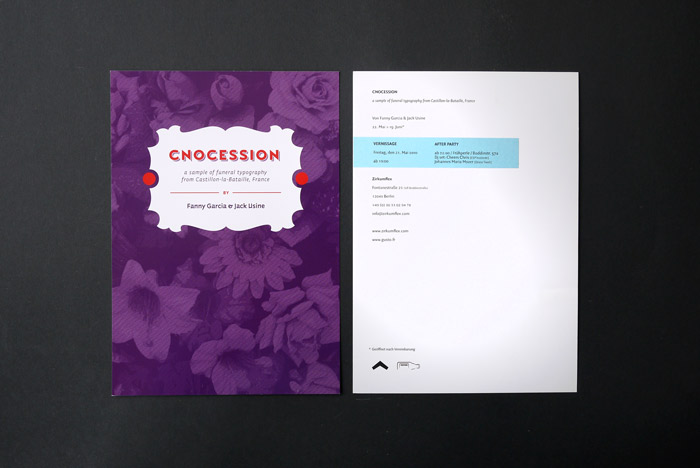
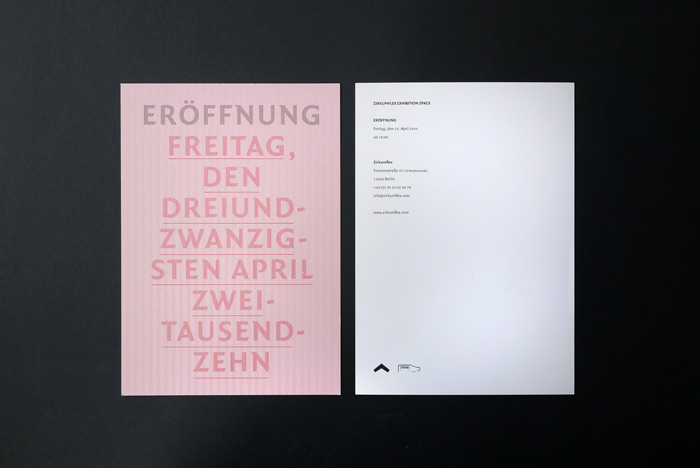
The typographic system is based primarily on FF Meta, a humanist typeface known for its clarity and versatility.
Its balanced and expressive design makes it particularly suitable for editorial contexts while maintaining excellent readability across different media. Within the identity, FF Meta provides a coherent typographic foundation for publications, studio communication and exhibition materials.
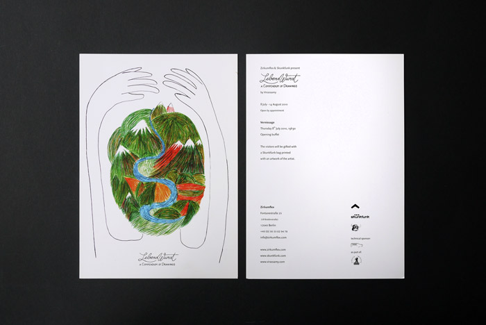
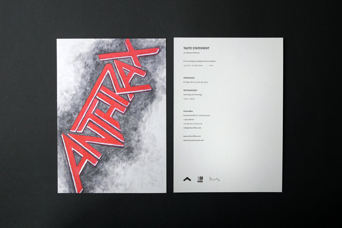
Solution
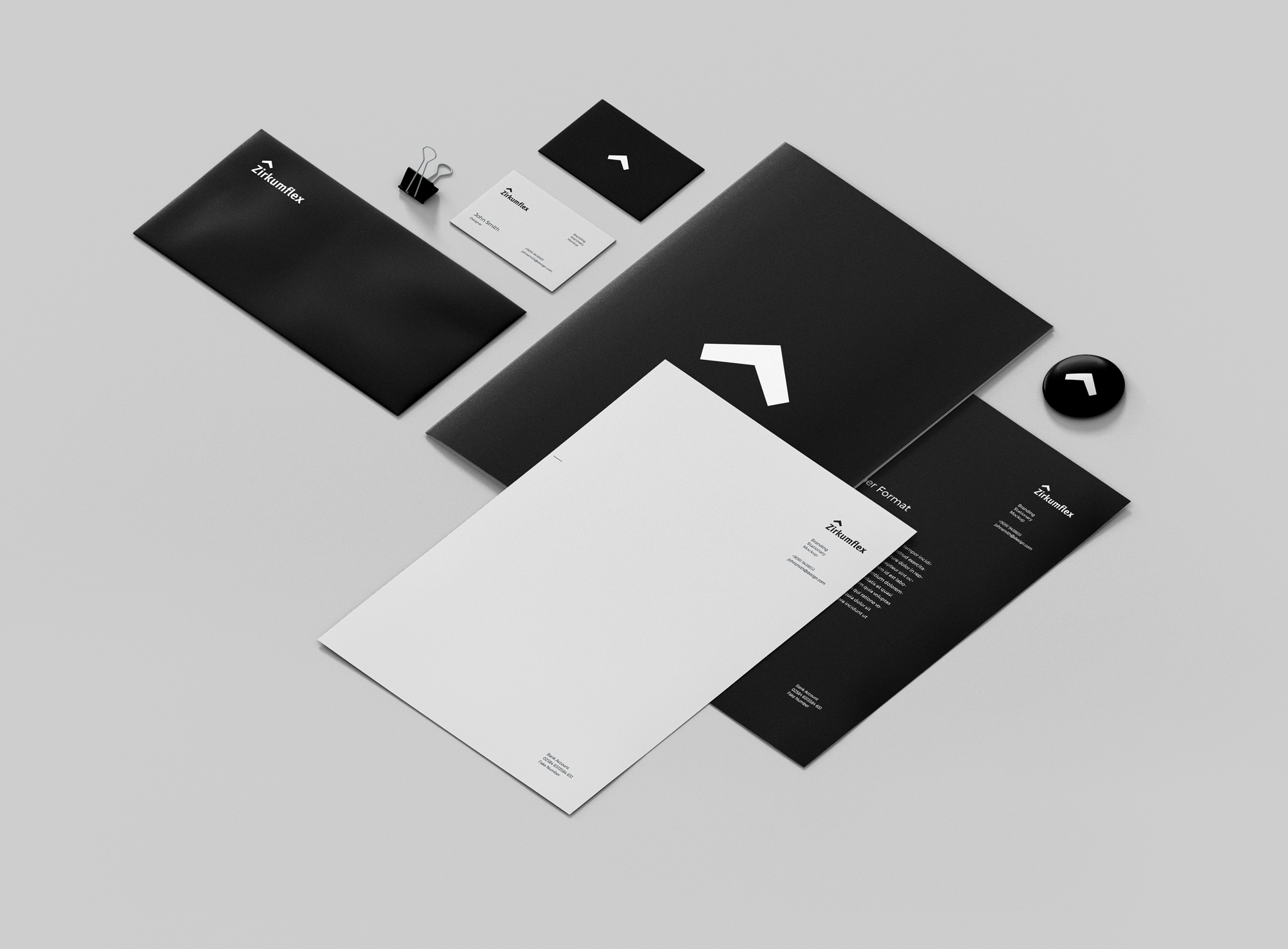
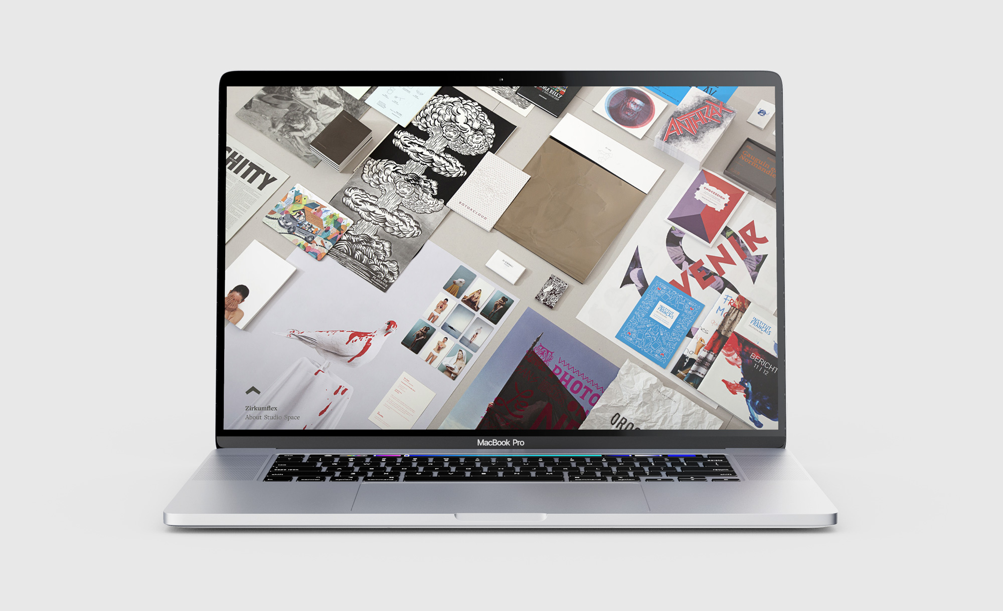
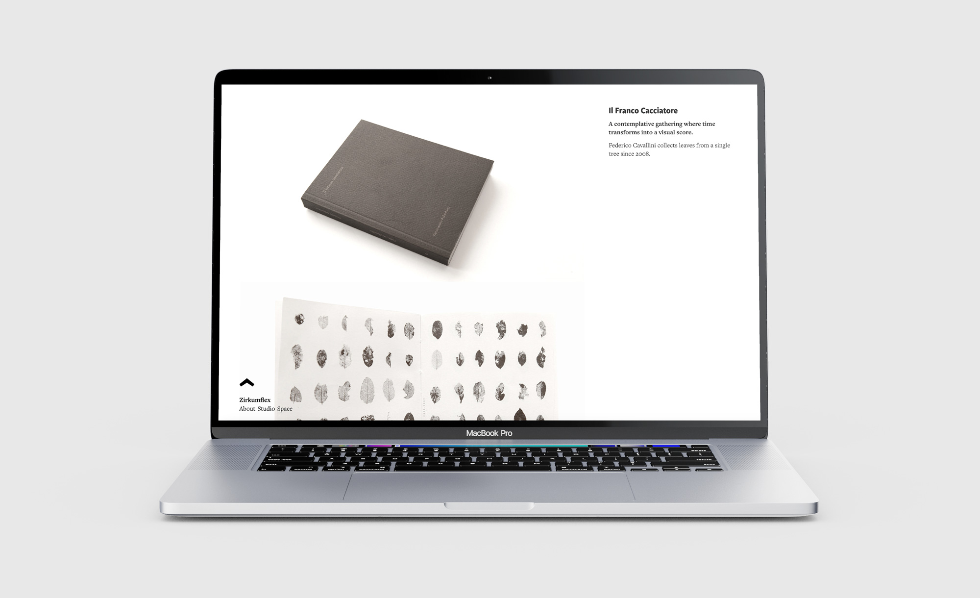
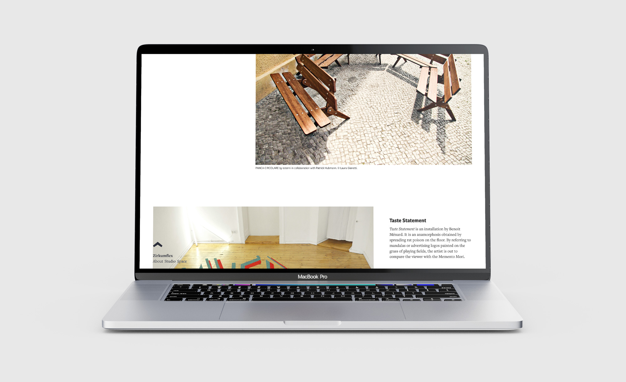
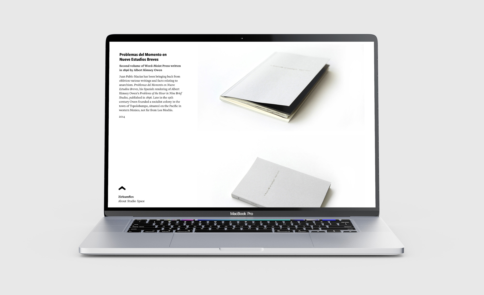
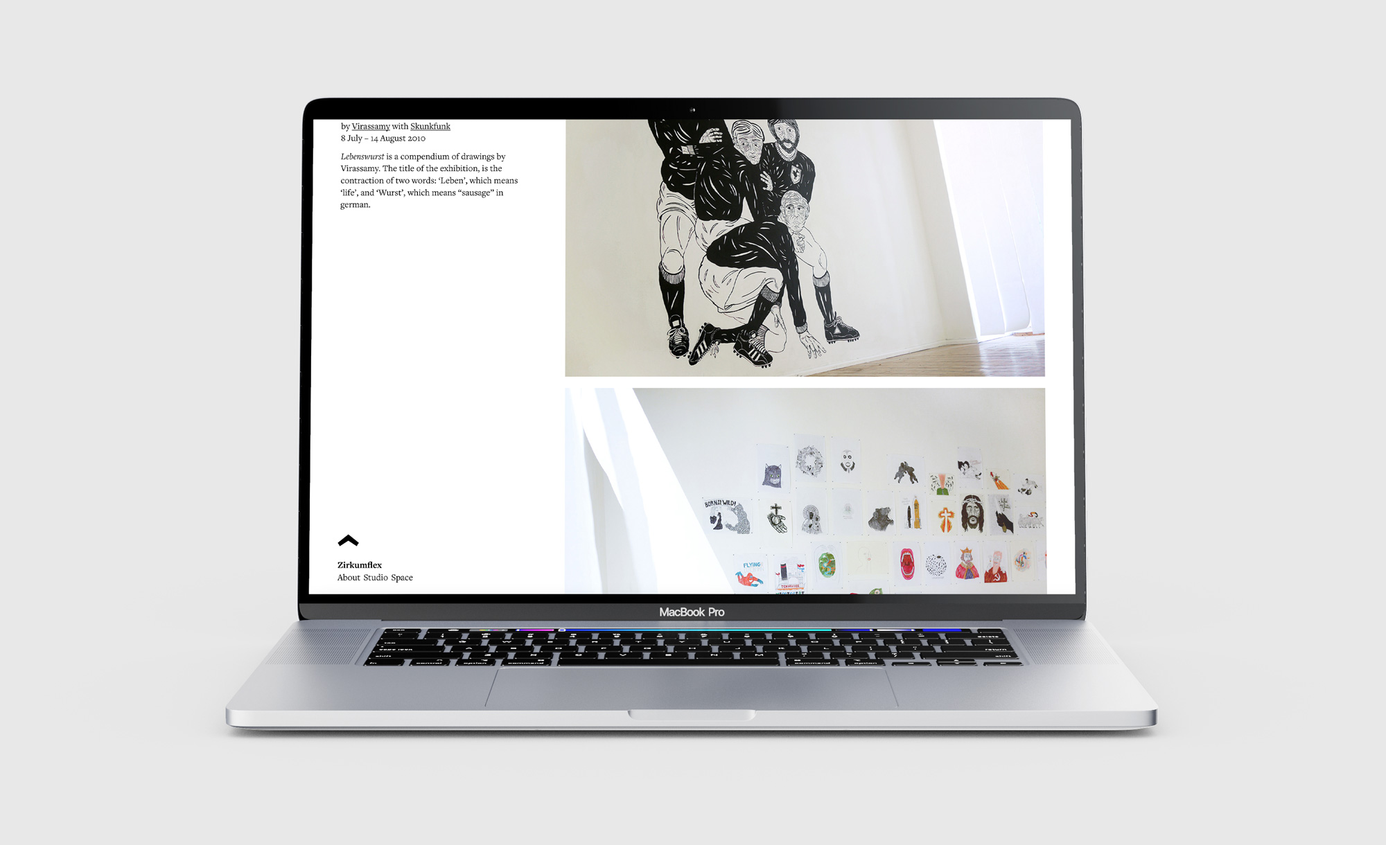
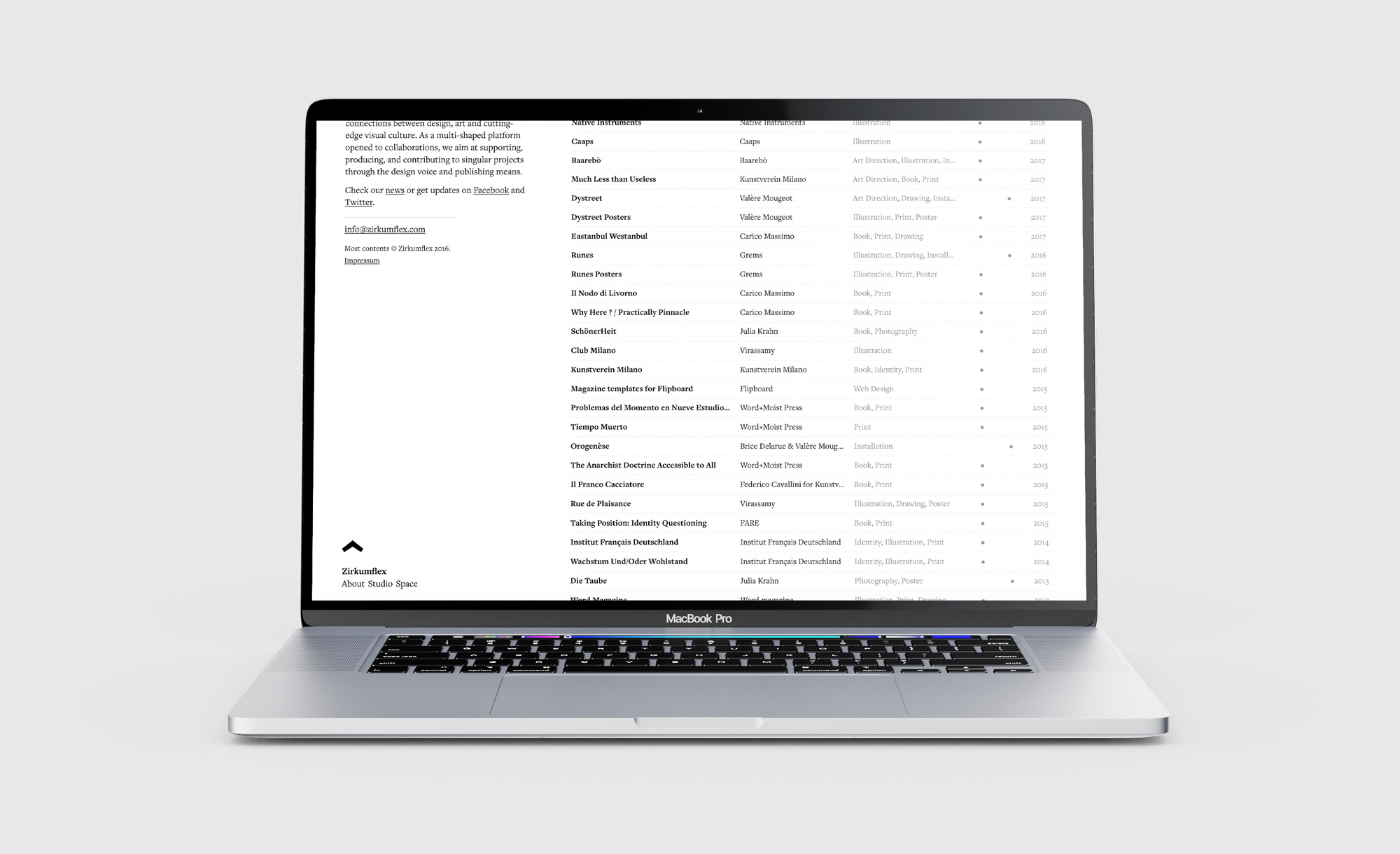
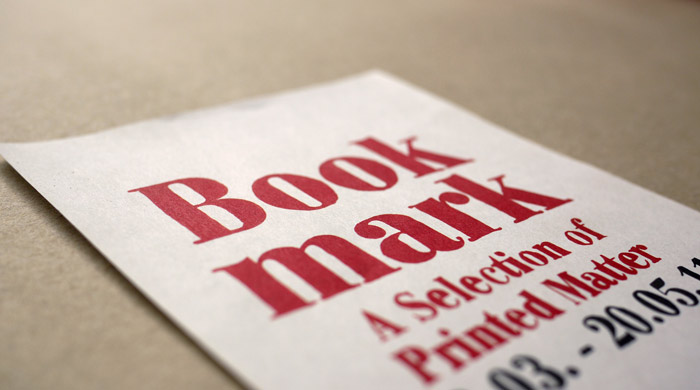
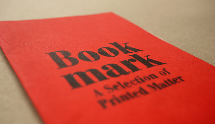
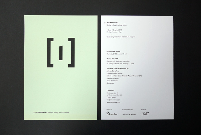
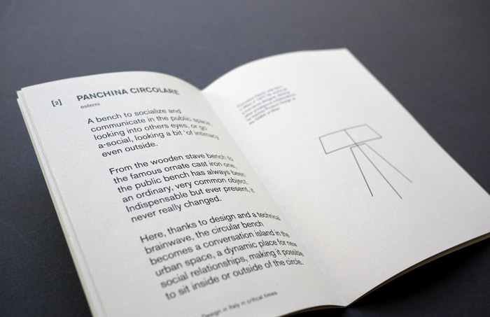
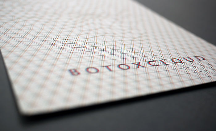
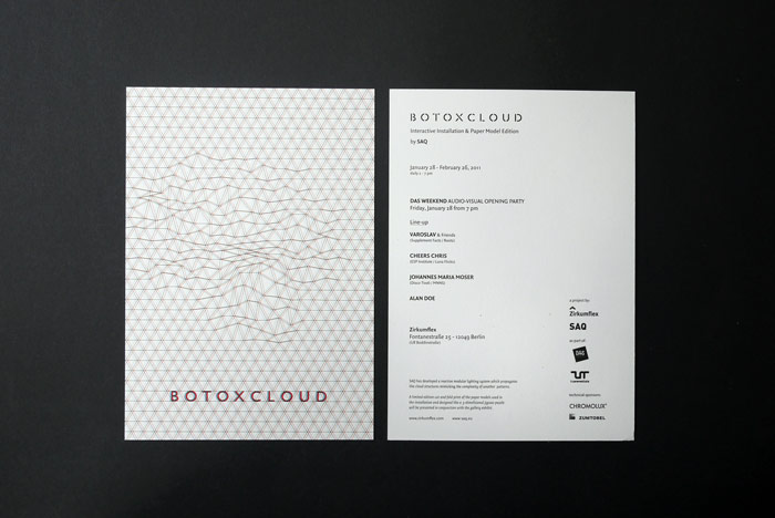
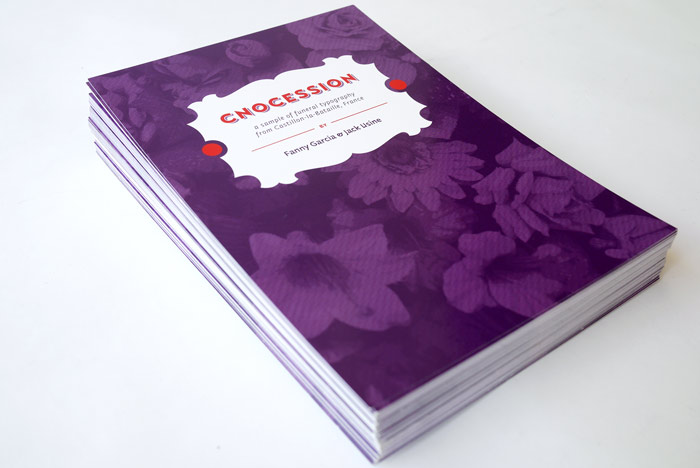
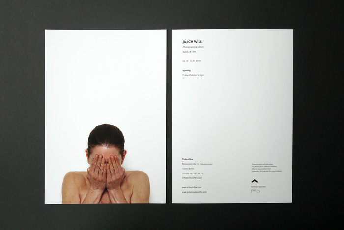
The identity was conceived as a minimal and flexible graphic system capable of adapting to a wide range of formats and contexts.
The combination of a simple graphic sign, a strong editorial typeface and a restrained visual language creates a framework that remains consistent while allowing the diversity of projects and exhibitions to take center stage.
Rather than imposing a dominant aesthetic, the identity acts as a supportive structure, enhancing the visibility and coherence of the work presented.